The CafePress Experience With Ads

When CafePress first started printing shirts in 1999, online retail was still a nascent industry and Google had yet to sell its first ad. Soon CafePress started selling products through search ads on Google, and their business took off. Today, CafePress hosts millions of shops online where customers can choose from more than 325 million products on nearly any topic, from wall art to phone cases.

Just as CafePress has broadened its offerings over time, we’ve also worked to improve and expand our search advertising products. What started as three lines of simple text has evolved into ads that are multimedia-rich, location-aware and socially-amplified.

Today CafePress uses Sitelinks to direct people to specific pages of their website, helping customers find what they’re looking for faster. On average, ads with three rows of links, or three-line Sitelinks, are more than 50 percent likely to get clicked on than ads without Sitelinks. More than 200,000 advertisers have joined CafePress in using Sitelinks in at least one campaign.

Monday at Advertising Week in New York City, I’ll be talking about how advertisers have been quick to adopt these new formats since we first began experimenting nearly two years ago. Businesses from the smallest retailer in Idaho to the largest Fortune 500 company in New York have seen how these innovations in search advertising can help grow successful businesses. In fact, roughly one-third of searches with ads show an enhanced ad format.

Here are a few ways these new ad formats are helping people find valuable information faster:

Visual. Not only can you find theater times for a new movie, you can watch the trailer directly in the ad. Media ads put the sight, sound and motion of video into search ads. With Product Ads, people can see an image, price and merchant name, providing a more visual shopping experience. Because this format is often so useful, people are twice as likely to click on a Product Ad as they are to click on a standard text ad in the same location, and today, hundreds of millions of products are available through Product Ads.

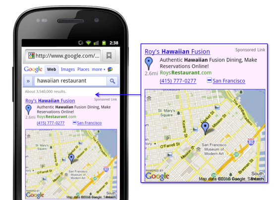
Local. More than 20 percent of desktop searches on Google are related to location. On mobile, this climbs to 40 percent. Location-aware search ads can help you find what you’re looking for more easily by putting thousands of local businesses on the map—literally. More than 270,000 of our advertisers use Location Extensions to attach a business address on at least one ad campaign, connecting more than 1.4 million locations in the U.S. via ads. And, with our mobile ad formats, not only can you call a restaurant directly from the ad, you can also find out how far away the restaurant is located and view a map with directions.

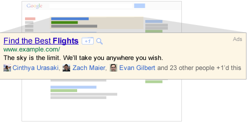
Social. With the +1 button people are able to find and recommend businesses with their friends. Since introducing the +1 button earlier this year, we now have more than 5 billion impressions on publisher sites a day. If you’re a business owner, the +1 button enables your customers to share your products and special offers easily with their network of friends, amplifying your existing marketing campaigns.

We’re continuing to experiment with search ads to help businesses like CafePress grow by connecting with the right customers.

We’re developing ads that provide richer information to you because we believe that search ads should be both beautiful and informative, and as useful to you as an answer.

Visualizing your location based data with Fusion Tables

Google Fusion Tables is a modern data management and publishing web application that makes it easy to host, manage, collaborate on, visualize, and publish data tables online. Fusion Tables allows for import of geospatial data to quickly and easily display that data on a Google Map.


The Fusion Tables team has been working hard to enrich what Fusion Tables offers for customization and control of the Google Map visualizations. Two very exciting announcements were made at Google I/O during the Fusion Tables session on Managing and visualizing your geospatial data with Fusion Tables. These announcements include the release of the Info Window and Styling in the Fusion Tables API and Fusion Table Styling in the Google Maps API. 


Info Window and Styling API

Previously, map styles and info window templates could only be customized via the Fusion Tables UI. The Info Window and Styling API opens up this functionality to the Fusion Tables API as well. There are many benefits of having API access to map styles and info window templates. For example:

  • This saves time when customizing hundreds of tables.
  • Since the styles and templates are JSON objects, it’s easy to serialize the objects and reuse them later.
  • The styles of public tables can be discovered and used for your own tables.

The Info Window and Styling API is still accepting Trusted Testers! If you’re interested in becoming a Trusted Tester, please join the Fusion Tables API Trusted Tester Google Group.

Fusion Tables Styles in the Google Maps API

Fusion Tables Styles further increases the possibilities of map customization. Rather than applying a style to a table via the API or UI, styling can now be introduced on the client side using the Google Maps API. There are many benefits to Fusion Tables Styles:

  • It allows for dynamic styling of map features.
  • It’s opens up the possibility for styling tables with multiple attributes.
  • You can give your users the opportunity to decide what range of styles works best for your data.
  • Third party developers can now generate visualizations of your data that differ from your own, which makes sharing your data more powerful and useful.

Fusion Tables styles are available now! Read more about how to use Fusion Tables Styles in the Fusion Tables Layer section of the Google Maps API documentation.

We’re already seeing some really nice uses of Fusion Tables for map customization. Simon Rogers, who joined us for the Fusion Tables I/O session to talk about how the UK Guardian Datablog uses Fusion Tables, has been making great use of Fusion Tables Styles. Here’s one of the Guardian’s latest examples. If you’re interested in creating a map similar to the Guardian’s, we have developed a template for plug-and-play.

What’s new since I/O?

Ever since I/O, we’ve been working to bring you new and interesting additions to the API. For example, this past month, we added IN to the list of supported column filters.


The new look of Google Maps

Hot on the heels of our new style for the Google Maps user interface, today we are pushing out some further improvements to our map design to match the updated look and feel and further improve the usability of our maps.

Amongst the changes you will find a plethora of subtle changes, designed to make the map cleaner, more focused, more visually harmonious, and easier to use. Some highlights to look out for are a brighter and more cheerful color palette, a more integrated and less visually noisy labeling style, subtle improvements to footpaths and minor roads, and cleaner building and land parcel rendering.

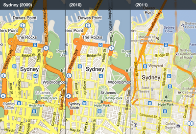
Most of these improvements, like many that we’ve made over the last couple of years, are gentle enough that many people won’t even notice the difference. When you add them together, however, and then compare to how the map looked even as recently as two years ago, it’s remarkable to see how dramatic the change is.

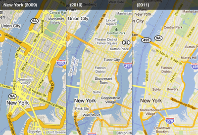
Compare how our maps of New York looked in 2009, then again the same time in 2010, and now with the new tiles for 2011. The improved colour scheme and less jarring label outlines help the labels to feel part of the map, as opposed to a distracting overlay. It’s also easier to distinguish the city name, neighborhoods, and roads through subtle changes in label color:

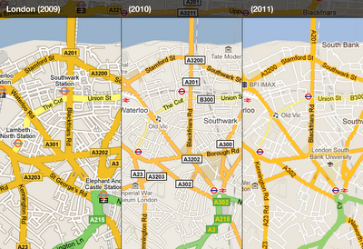
The visually heavy highway shields are now integrated into the road labels, and the brighter and cleaner style shifts the focus onto the road names and prominent landmarks in the area. London is one place that benefits from this:


The style evolution has enabled us to place more information whilst still making the map feel simpler. In the case of Sydney, thinner and cleaner roads, better representation of tunnels, more subtle footpaths in the parks, and more subtle labeling all contribute:


We hope you enjoyed this quick retrospective and find the new improvements to the map style helpful. There are many more than have been highlighted here, so have a look around Google Maps today and see if you can spot any improvements to your local area.