Mining for gold with MineCache

Last year, we showed you a feature from Gold Maps Online that helped you find areas that were currently being mined. It had some interesting and potentially useful maps, though they charge for access.

Now we’ve been introduced to a company called MineCache. MineCache takes the raw data from the USGS MRDS (United States Geological Survey, Mineral Resource Data System), cleans out the non-applicable items (other minerals, etc), and then presents it in the form of a very nice network link.

minecache.jpg

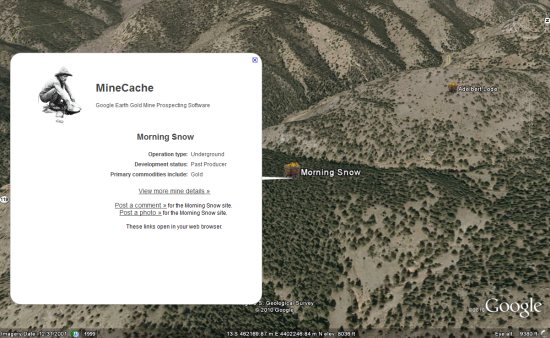
The site typically requires that a user register for an account before they can use the files, so that users can post photos and comments. However, for those of you simply wanting to poke around and play with it, they’ve created a special KML file to let you try it out.

The only problem I had is that I didn’t know where to look. I’d zoom around and it would always say “No gold mines here”. I suppose this wouldn’t be a problem for people that are genuinely needing a tool like this, but it was a bit frustrating for me. If you have the same problem, just fly to this KML file with their network link active and you should see a few.

If you’re the kind of user that is interested in this type of tool, do you find this more useful than the “Gold Maps Online” we showcased before? Why or why not?

New Google Earth Imagery – January 24

It’s been over a month since the past update, but thanks to some sharp-eyed GEB readers (‘Andreas’ and ‘r m’), we’re now aware that Google has just pushed out a new update!

imagery.jpg

As is usually the case, you can use Google Maps to determine for sure whether or not a specific area is fresh. This new imagery isn’t in Google Maps yet, so you can compare Earth vs. Maps to see what’s new; the fresh imagery is already in Google Earth, but the old imagery is still in Google Maps. If you compare the two side-by-side and they’re not identical, that means that you’ve found a freshly updated area in Google Earth!

[UPDATED — 23-January, 5:08pm EST]

  • Canada: Manitoba and northwestern Ontario — thanks ‘Steven’
  • China: Takla-Makan desert and Tibet — thanks ‘Neutravo’
  • England: Various areas — thanks ‘Steven’
  • Ireland: Ballycotton, Castlebar, Kinsale — thanks ‘r m’
  • Norway: Maloy — thanks ‘Andreas’
  • Scotland: Various areas in the southwest area of the country — thanks ‘Dunk’
  • Spain: Catalonia and Zaragoza — thanks ‘Nacho’ and ‘Neutravo’
  • Ukraine: Pervomaisk and Sevastopol — thanks ‘Sean’
  • United States: Florida (Lakeland, Sarasota), Georgia (Macon, Augusta), Illinois (Champaign), Missouri (Branson and Springfield) and Ohio (Toledo) — thanks ‘Kevin’ and ‘Munden’

If you find any other updated areas, please leave a comment and let us know!

In the Crosshairs

Sarah Palin's crosshairs map, The Stranger's crosshairs map

A map was at the centre of a major news story in the United States this week. Within hours of the news that Rep. Gabrielle Giffords (among others, to be sure) had been shot at a constituency meeting in Tucson, Arizona, copies of a map from Sarah Palin’s political action committee, first released a year ago, began circulating online in response. The map targeted for defeat 20 Democratic members of the U.S. House of Representatives who voted for health care reform but who represented districts carried by McCain-Palin in 2008 — and it did so with crosshairs. Rep. Giffords was one of those members, and in the anger and confusion that followed the shootings, it was very easy for some to see in the map a call that was taken a little too literally by the shooter. There’s been an awful lot of debate since that weekend about rhetoric and responsibility — and what the map really meant (surveyor’s marks?!) — that I won’t get into here; I just feel it’s necessary for me to note the role of the map’s design in the ensuing fracas.