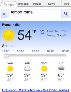
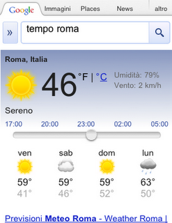
Earlier this year, we introduced interactive weather information in mobile search results and now this feature is available in 33 more languages. Now when you search for ‘météo’, ‘tempo’, ‘날씨’, or ‘weather’ in your language, you’ll see the current temperature, humidity level and wind speed for your location. You’ll also get an overall forecast and the weather outlook for the next few days. To see weather conditions at various times throughout the day, move the slider across the next 12 hrs; that way you’ll know if you’ll need a light jacket in the afternoon or perhaps an umbrella in the evening.
SketchUp: A better view of small spaces
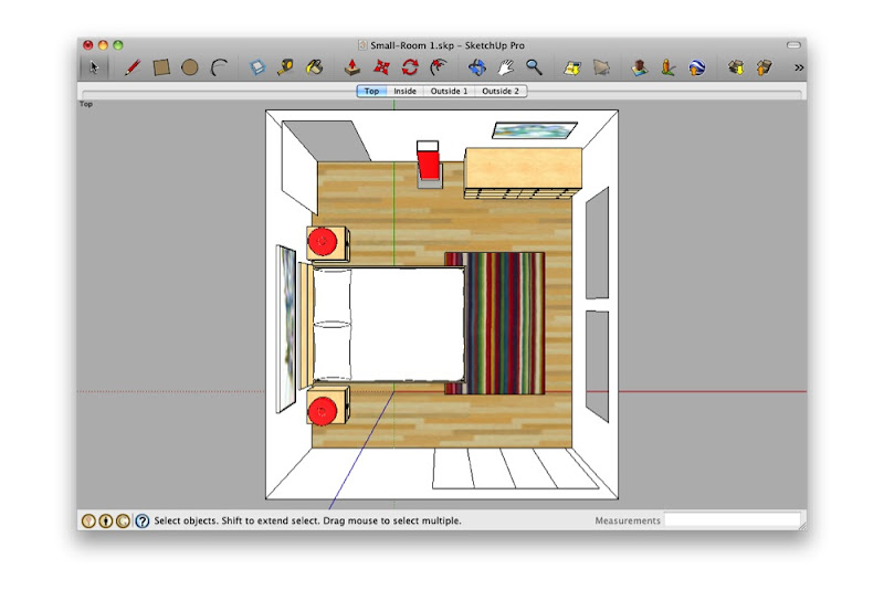
When you’re modeling a small room, it can be a pain to see what’s inside. The problem is that the walls and ceiling get in the way. One solution is to lop off the ceiling and work in a top view, dollhouse-style. Other folks set up scenes from the interior corners and adjust their Field of View to something super-wide like 90 degrees.
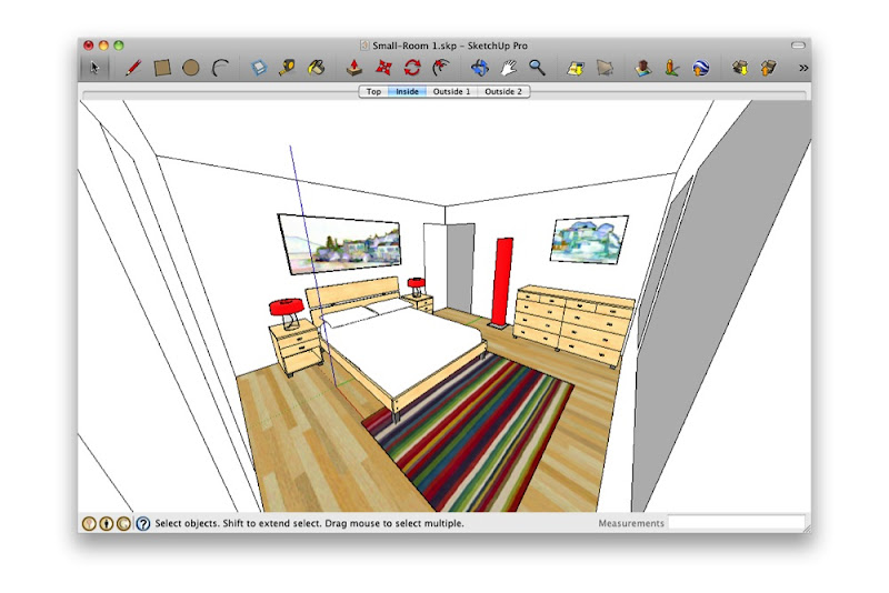 Standing in the corner and making your Field of View really wide is just weird. What are you—a housefly?
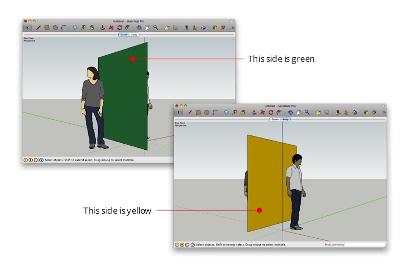
Both of the above techniques work—to a point. Personally, I think it’s like trying to read a book through a keyhole. By far my favorite method for working on small interiors is to make use of SketchUp’s ability to have faces with different materials on each side:
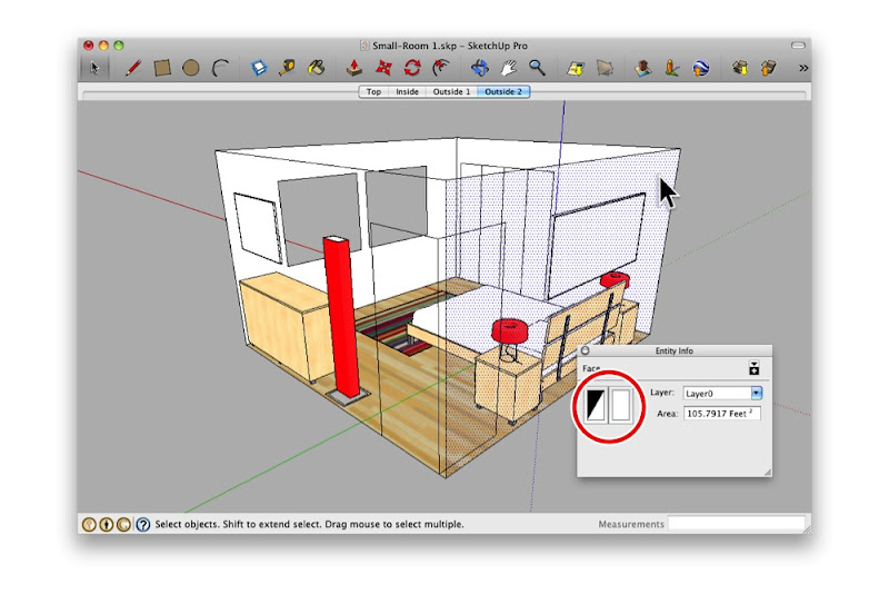
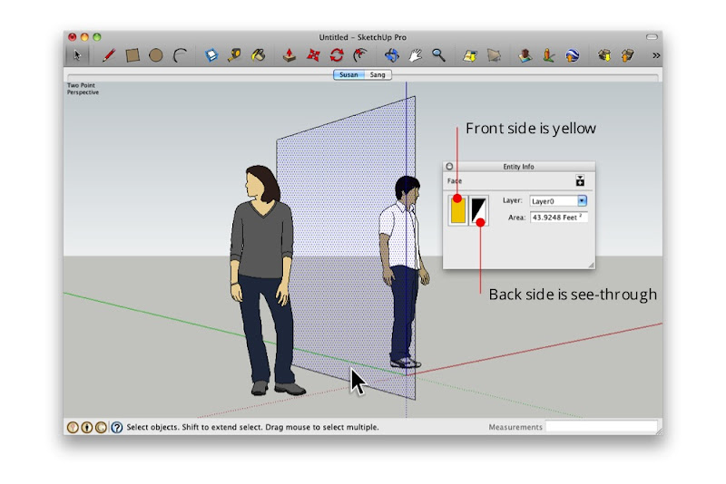 The Entity Info dialog box shows that the selected face is yellow on the front and see-through on the back.
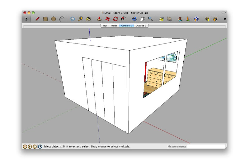
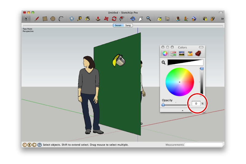
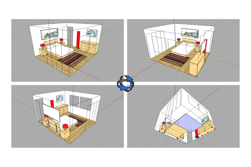
By painting the outward-facing surfaces with a see-through material—one whose opacity is set to 0%—I can see in from the outside. Super useful, super simple.
The new Search app for iPad from Google
More interactive
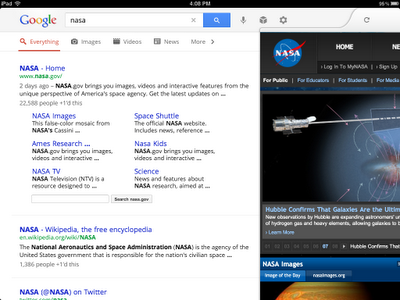
Once you pick a web page to visit, you’ll see the page load on a new, slide-in pane that will layer over the search results. You can slide the pane to the right to get back to your search results, and even keep scrolling through the results as your web page is loading. This allows you to go back and forth from results to web pages quickly to get the information you are looking for.
View search results on the left and a web page on the right in the slide-in pane
More visual
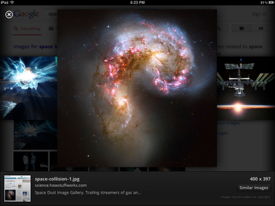
Swipe through the image carousel
Often you may be looking to find something you have seen before again or are continuing research on a topic. But on a tablet, typing can be a challenge. That is why we have created a visual way to explore your search history. Swipe right to view snapshots of pages you’ve visited, stacked and organized by search term. You can also manage your search history from this new view.
Find easily
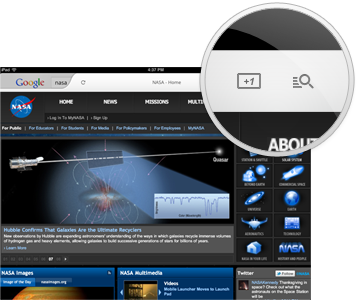
After you’ve selected a result, a new tool helps you find exactly what you need within a web page. Tap the magnifying glass on the top right-hand corner to highlight the most relevant section of the page. You can recommend pages you like with the new +1 button, right next to the magnifying glass, and help others find relevant sites more easily as well.
Helpful tools while you search
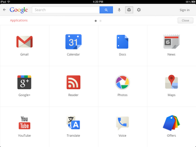
We’ve also made it easier to find and use your favorite Google services like Google News, Calendar and more in the new Apps menu. Tap on an icon to quickly read an email in Gmail, or share a post on Google+ within the slide-in pane. When you slide the pane to the right, you’ll be right back to searching.
Easily find more Google services
The app is available worldwide for iPads with iOS 4.0+. Download it in the App Store and start enjoying a faster and more interactive experience now.
