Getting from A to B just got a little easier

Over the past year, the Google Maps Directions team has been hard at work developing a variety of design improvements to make getting and following directions much easier.

It’s now simpler than ever to switch transport modes, change the time/date of your trip, get a high-level overview comparing different routes, and view details of a single trip at-a-glance.


To explore these improvements in more depth, let’s imagine that you’re planning a trip to visit the beautiful city of Zürich, and would like to take public transportation from the airport to your destination in town.

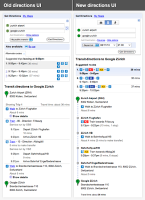
We’ve made it super quick and easy for you to see all the available modes of transportation when you’re planning a route – you can see that driving, public transit, and walking are all available in this area. The options for setting a time and date for your trip are also now open by default for public transit
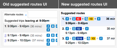
Having selected your start location and end destination, you are presented with a series of suggested routes to take you from A to B. Each description is now much richer, making it easier to differentiate between similar routes:


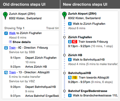
Once you select a route, the individual steps for the trip are dramatically simplified and cleaner in the new design. The stations at which you’ll need to transfer, and the number of stops in between are now much more apparent. The sections of the route that involve walking are also much easier to spot since they’re indicated by a dotted line on the left:


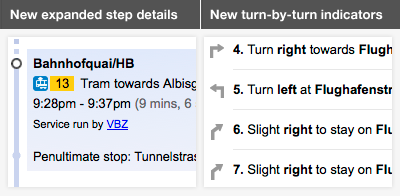
Clicking on any step will also display more information. For example, we now show the stop preceding the one where you’ll need to get off, so that you can get your bags ready and prepare to disembark. And we’ve introduced turn-by-turn direction indicators for walking, driving and cycling:


Stay tuned for further changes as we continue to refine and improve your experience using directions from Google Maps. Enjoy your travels!

Timelines and Tours outside Google Earth

I’ve come across a couple of examples of GEarth features implemented elsewhere which were worth a mention:

Timeline Example: I thought this timeline from a New York Times graphic is much better than the timeline in Google Earth:
  • Easier to grab and move the jaws, in GEarth the jaws are too small
  • The play button only allows the jaws to move together, in GEarth you can press play and the far side of the jaws will move which is too complex for users to understand and utilise IMHO
  • The time labels are simple and clear whereas in GEarth the labels are more fussy
  • The blue shading communicates ‘this is the time range’ in a clear way and its semi transparent so you can see the graph below it.
The GEarth timeline remains high on my list of things Google should really fix in GEarth.
Tour Example: I think the tour feature of GEarth is one of its strongest features allowing user in presentations or promotional film clips. I came across a film sequence in a TED talk which has a form remarkably like a tour:
(BTW the clip is fascinating and well worth watching in full)
The clip ‘zooms’ down from large to small scale and at the destination scale the camera moves around a 3D object which is then manipulated in various ways to illustrate the relationships of neurons. Compare it with this GEarth tour:

The building clip has a poor frame rate and the building isn’t manipulated in some way (like showing the inside rooms) but otherwise, the format is exactly the same. I’m in the middle of researching to best design tours at the moment and the Seung clip is a lovely illustration of how the results of my studies will not just apply to GEarth and other Virtual Globes but to any 3D visualisation system where zooming across scales in a film clip is important.

With the Seung clip I defined where it should start, see how to get a YouTube video to start where you want it.