Sarawak: The damaged rainforest

The state of Sarawak, in Malaysian Borneo, is the site of an interesting political battle recently. Their Chief Minister claims that 70 of Sarawak’s forest cover is intact, but imagery from Google Earth seems to indicate that it’s far worse than that. In fact, some environmentalist groups estimate that logging has cost Sarawak 90 of it’s primary forest cover.

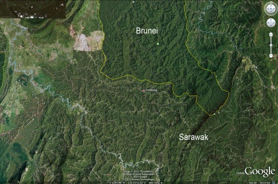
Mongabay has written a very detailed article about this situation, including quite a few photos. For example, the image below clearly shows logging roads all throughout Sarawak, while virtually none are visible in Brunei to the north.


sarawak.jpg 

Google Earth is making it increasing difficult for governments to lie about this kind of behavior. As the pace and quality of imagery updates continue to improve, things will only get better for those that wish to expose this type of thing.

Be sure to read the entire article on Mongabay for more information and many more photos.

How Google Earth displays dates on their imagery

As you probably know, when you’re looking at an area on Google Earth, the date the imagery was captured appears in the lower-left corner, as shown here:

imagery-date.jpg

However, what does that date actually mean? As some of you have pointed out, the date doesn’t always correspond with the imagery (snow on the ground in July, etc).

For standard satellite images, it’s simply the date the imagery was taken, which makes sense. Easy enough. The discrepancies arise when Google loads imagery for a large area from a commercial aerial provider. In those cases, they’re given a range of dates for the imagery. The date you see on the screen is the “oldest known date” for that imagery, while the tic mark in the Historical Imagery sliders is the “newest known date”. In many cases, those date ranges can be up to a few months apart.

To confuse it further, some providers don’t even have exact dates for a batch of imagery; they might simply say “April-June, 2010”. In those cases, Google considers that to be “April 1 – June 30, 2010”, and then displays the date as explained in the previous paragraph.

While the system obviously isn’t perfect, it’s certainly improving. Google Earth didn’t start showing the date in the corner until version 5 came out (so you had less of an idea of when the imagery was captured), and the Historical Imagery tool was certainly a great addition to Google Earth.

As the pace and quantity of imagery updates continue to increase, I expect we’ll see some refinements to this system over the coming years to help it become even more accurate and useful.