Android Apps Over the 50MB Barrier


Android applications have historically been limited to a maximum size of 50MB. This works for most apps, and smaller is usually better — every megabyte you add makes it harder for your users to download and get started. However, some types of apps, like high-quality 3D interactive games, require more local resources.

So today, we’re expanding the Android app size limit to 4GB.

The size of your APK file will still be limited to 50MB to ensure secure on-device storage, but you can now attach expansion files to your APK.

  • Each app can have two expansion files, each one up to 2GB, in whatever format you choose.
  • Android Market will host the files to save you the hassle and cost of file serving.
  • Users will see the total size of your app and all of the downloads before they install/purchase.

On most newer devices, when users download your app from Android Market, the expansion files will be downloaded automatically, and the refund period won’t start until the expansion files are downloaded. On older devices, your app will download the expansion files the first time it runs, via a downloader library which we’ve provided below.

While you can use the two expansion files any way you wish, we recommend that one serve as the initial download and be rarely if ever updated; the second can be smaller and serve as a “patch carrier,” getting versioned with each major release.

Helpful Resources

In order to make expansion file downloading as easy as possible for developers, we’re providing sample code and libraries in the Android SDK Manager.

  • In the Google Market Licensing package, an updated License Verification Library (LVL). This minor update mostly adds the ability to obtain expansion file details from the licensing server.
  • From the Google Market APK Expansion package, the downloader service example. The library makes it relatively simple to implement a downloader service in your application that follows many of our best practices, including resuming downloads and displaying a progress notification.

Because many developers may not be used to working with one or two large files for all of their secondary content, the example code also includes support for using a Zip file as the secondary file. The Zip example implements a reasonable patching strategy that allows for the main expansion file to “patch” the APK and the patch file to “patch” both the APK and the main expansion file by searching for asset files in all three places, in the order patch->main->APK.

Expansion File Basics

Expansion files have a specific naming convention and are located in a specific place for each app. As expansion files are uploaded to the publisher site, they are assigned a version code based upon the version of the APK that they are associated with. The naming convention and location are as follows:

Location: /Android/obb//
Filename: [main|patch]...obb
Example: /sdcard/Android/obb/com.example.myapp/main.5.com.example.myapp.obb

Expansion files are stored in shared storage. Unlike APK files, they can be read by any application.

Downloading and Using the Expansion Files

When the primary activity for the app is created, it should check to make sure the expansion files are available. The downloader library provides helper functions (for example the “Helpers” class in the code below) to make this easy.

boolean expansionFilesDelivered() {
    // get filename where main == true and version == 3
    String fileName = Helpers.getExpansionAPKFileName(this, true, 3);
    // does the file exist with FILE_SIZE?
    if (!Helpers.doesFileExist(this, fileName, FILE_SIZE, false)) {
        return false;
    }
    return true;
}

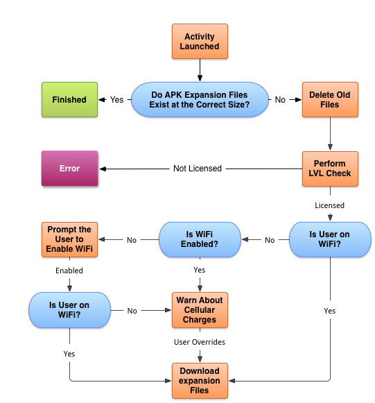
If the file does not exist, fire up the downloader service with DownloaderClientMarshaller.startDownloadServiceIfRequired(). The downloader will perform an LVL check against the server. This check will deliver the names of the files, file sizes, and the file URLs.

Once that check has been completed, it will begin downloading the files. You don’t have to use our download solution, but you might want to because we:

  • Include a notification UI that provides progress and estimated completion time in layouts customized for ICS and pre-ICS devices
  • Resume large files safely
  • Handle redirection with appropriate limits
  • Run in the background as a service
  • Pause and resume downloads when WiFi is not available

Enjoy! We can’t wait to see what kinds of things developers do with this! For more information about how to use expansion files with your app, read the APK Expansion Files developer guide.

Historical imagery on Street View?


I really like the historical imagery feature in Google Earth. It’s a very useful feature that allows you to look at some neat things, and it’s a great way to visit the past in various areas around the world.

As reveled in a thread in the Google Earth Hacks message board by ‘Munden’, there are some signs that perhaps a “historical imagery” view is coming to Google Street View in the future.

He’s found a number of areas that have multiple Street View imagery versions available online, and he cites a handful of examples such as this building that looks like a giant sheep. Here is the old image, here is the new image, and here is what they look like side-by-side:


sheep-house.jpg 

In his testing, Munden has discovered some interesting things:

In New Zealand, old imagery isn’t the default but isn’t removed anymore. My old links will call up the old low resolution images, even on browsers that have never seen that URL before. I’ve even cleared the caches. Google definitely has the old images in their Street View database. You can switch by dragging the Pegman by a pixel or two and suddenly you’ll be in the new imagery and stay there no matter how much moving around you do.

It’s important to note that once you are viewing an older image if you use the SV in-picture arrows to move through the pictures, you will stay in that older imagery. You have to drag the Pegman to switch to new imagery, as I mentioned previously. This could simply be an artifact of the old URL, and they have no plans to create a history of Street View of course. I find it most interesting that you STAY in the old imagery once you’re viewing it though.

Other examples include a futuro home (old image, new image), or the “Christmas decorations” location that ‘sladys’ found — the new imagery is embedded on the site, but the old imagery can still be found via this URL.

Ultimately, all of this might not mean anything. Google hasn’t made any announcements about anything related to historical Street View imagery and they may have other reasons for keeping the old imagery accessible. In any case, it’s a neat little feature that Munden has uncovered and may be a sign of things to come.

Unified Map Design of Bing Maps and Nokia

Last year, we entered into a strategic partnership with Nokia which included plans to offer a unique and compelling mapping experience for our customers. Since then we’ve been working with Nokia and Windows Phone to deliver a unified map style based on one set of design principles with the goal of providing a more intuitive and pleasing online mapping experience. Our Bing Maps designers teamed closely with our partners at Nokia Maps and the Windows Phone team to unify our map elements, improve contrast and usability to ultimately create a more beautiful and functional map. Today we’re excited to share the new map design, available on desktop and mobile versions of Bing and Nokia maps.

Let’s take a closer look at the updates.

Common color palette for road map style
We’ve updated our color palette to create a cleaner and consistent view of roads and landmarks resulting in a map that’s easier to interpret. For instance, the new road color is further clarified from rivers while not competing with traffic colors or overlaid information.

Celebrate Typography

We focused significantly on improving various typography components in order to provide further clarity on maps including font updates, improved readability and contextual labeling. Type size hierarchy further delineates classes of labels. The user watches city names consistently grow and become more transparent through the zoom levels. Small type is demystified from its surroundings with a technique that reduces clutter instead of adding glows or ever-present strokes. The right use of typography helps our customers consume mapping details more quickly.

Using Visual Hierarchy to create Focus and maintain context

At each level, there’s an appropriate amount of information conveyed to the user. Too little or too much information can lead to overload and thereby an unpleasant user experience. We’ve redesigned with this in mind, so a very different level of information is presented to you when you zoom compared to when you pan out. Go in for detail, pull back for context. We strive to keep the orientation and context of a user within the map surface persistent across various levels of zoom.

In addition to our map design updates, we’re also adding a significant amount of mapping coverage and data due to our partnership with Nokia and NavTeq. Each map data refresh from NavTeq brings with it many improvements, and each one also attempts to include as many new roads/subdivisions/ changes/etc. as possible.  This update is no exception and the changes are too vast to list but most notably, there are a few entire countries that really improved including Egypt, Israel, Malta, Philippines, Uruguay and Venezuela to name a few.

All in all, we believe that the new map styles available on Bing Maps (http://www.bing.com/maps) and Nokia Maps (http://maps.nokia.com) and on your mobile device are easy, satisfying, and truly a delight to use.