Garmin: Which watch fits fitness fans?


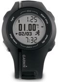
Every give-a-Garmin season, I hear a chorus of questions from friends and family seeking insider shopping tips. This week, I heard from Kathy, who heads up our local Girls on the Run council. She wanted to know what to get hubby Mark, who keeps his fitness in check with daily walks and wants to log every mile and minute. I had two picks: the sleek and stylish Forerunner 210, which tracks distance, time, pace and calories and comes with or without heart rate. For upcoming “snow days” when he can’t get outside, he canpair the 210 with the optional foot pod to track distance indoors.

My second pick is another wrist-worn wonder: the Approach S1 golf watch. I know Mark loves his time on the greens, and since Approach S1 is GPS-enabled, it could double as his distance tracker on and off the course. For golfing, it measures distance to the front, back and middle of greens for more than 17,000 preloaded courses.

I’m also recommending the newest Forerunner 210 with teal accents for a friend and for my sister. They’ve both been very good girls this year and get to check off “half marathon” from their 2011 resolution list. I like the Forerunner 210 for them because it’s super easy to use, gives accurate distance and pace data and it looks good/feels good. And for runners who want a little more, it offers customized interval sessions to guide their speedwork.
Sea Ice Extent updated for 2011


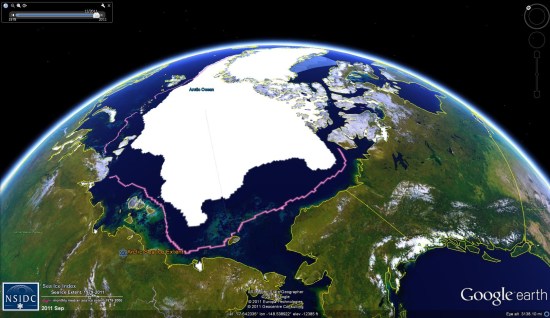
As they’ve done for the past few years (here is 2010), the National Snow and Ice Data Center (NSIDC) has produced their annual Sea Ice Extent data


extent-2011.jpg 

While 2011 wasn’t a record year for ice loss, it came close, ending just slightly above the mark set in 2007. You can view the data for yourself by loading this KMZ file.

Here are the details for this year:

Average ice extent for September 2011 was 4.61 million square kilometers (1.78 million square miles), 2.43 million square kilometers (938,000 square miles) below the 1979 to 2000 average. This was 310,000 square kilometers (120,000 square miles) above the average for September 2007, the lowest monthly extent in the satellite record. Ice extent was below the 1979 to 2000 average everywhere except in the East Greenland Sea, where conditions were near average.

As in recent years, northern shipping routes opened up this summer. The Northern Sea Route opened by mid August and still appeared to be open as of the end of September. The southern “Amundsen Route” of the Northwest Passage, through the straits of the Canadian Arctic Archipelago, opened for the fifth year in a row. Overall, sea ice in the wider and deeper northern route through Parry Channel reached a record low, according to Stephen Howell of Environment Canada, based on Canadian Ice Service analysis. Parry Channel had a narrow strip of ice that blocked a short section of the channel, but it did appear to open briefly in early September.


Find your perfect home with Google Fusion Tables

My husband and I were recently in the market for a new home. We worked with a realtor for a few months, looking at several houses every weekend. As we checked out each house, we tracked our thoughts about it in a Google spreadsheet, which included columns for the address, our pros and cons, individual ratings and the combined rating of the house.

One day, while my husband and I were rating a recently viewed home, he came up with a brilliant idea to put all of our home data on a map. We realized that adding geographic information to our personal opinions would help us find trends, such as which neighborhoods we preferred. A light bulb went on over my head: Google Fusion Tables!

Fusion Tables is a data management web application that makes it easy to view tabular data on a Google Map. Columns with location data, such as addresses, points, lines, or polygons, are automatically interpreted and mapped. The map features can be styled according to the data in your table. It’s also simple to share the map visualization with others.

In just a few steps, we were able to convert our spreadsheet into a fusion table:


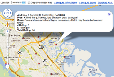
This was a great start, but what we really wanted was to quickly get a glimpse of this data on a map. All we had to do was select ‘Visualize > Map’ from the table menu and the data in the ‘Address’ column was geocoded (i.e. converted into latitude and longitude coordinates) and the markers were displayed on the map. Clicking on the markers showed additional information about the house pulled from our spreadsheet, including the pros, cons and ratings we inputted for each location.

Our house ratings viewed in Google Maps (after being converted into a Fusion Table).
Fusion Tables also allow you to style the features on the map according to data in a numerical column in the table. We had the perfect column to use for this purpose: the ‘Total Rating’ column!


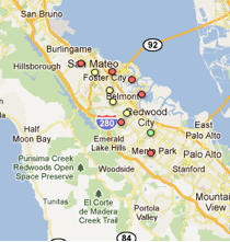
In order to color code the map markers by their ‘Total Rating’ score, we customized the icons based on a range of scores, with red representing the lowest scores, yellow show mid-range scores and green showing the houses with the highest combined rating. After saving these new settings, the map markers were immediately styled:


Our new map made it much easier to see what locations we were most interested in (the house just south of Redwood City) and the neighborhoods of low interest (those that were closer to the bay or hills).

We shared the map with our realtor and she loved it. It helped her refine the selection of homes she showed us and in just a matter of weeks, I’m happy to say that my husband and I found the perfect house!

Posted by Kathryn Hurley, Developer Programs Engineer, Geo DevRel

via: GoogleLatlong