Strange Google maps shapes

Strange things you can find with Google maps. 

Something that looks like the All Seeing Eye near Area 51: 
http://maps.google.com/maps?ll=37.666926,-116.027856&spn=0.015600,0.021286&t=k&hl=en
 
A triangle: 
http://maps.google.com/maps?ll=33.745537,-112.633896&spn=0.015600,0.021286&t=k&hl=en
 
Circles: 
http://maps.google.com/maps?ll=37.487369,-116.228828&spn=0.015600,0.021286&t=k&hl=en
 
Circular fields in the desert (a load of these near Area 51 too): 
http://maps.google.com/maps?ll=39.686737,-115.924988&spn=0.015600,0.021286&t=k&hl=en
 
A star shape (A SAM site?): 
http://maps.google.com/maps?ll=37.402096,-116.867752&spn=0.005600,0.001286&t=k&hl=en
 
Some kind of target: 
http://maps.google.com/maps?ll=37.563586,-116.851358&spn=0.005600,0.001286&t=k&hl=en
 
 The HAARP site (took ages to find this): 
http://maps.google.com/maps?ll=62.39,%20-145.15&spn=0.005600,0.040286&t=k&hl=en
 
Area 51: 
http://maps.google.com/maps?ll=37.272835,-115.798731&spn=0.005600,0.040286&t=k&hl=en
 
The White House (Altered a lot): 
http://maps.google.com/maps?ll=38.896816,-77.036637&spn=0.006545,0.008680&t=k&hl=en
 
Just what are they hiding?: 
http://maps.google.com/maps?ll=38.890250,-77.007551&spn=0.008368,0.014012&t=k&hl=en

Google Earth: Visualizations from Tuesday’s earthquake


A few days ago, the eastern United States was hit by a magnitude 5.8 earthquake. The quake did relatively little damage, though it was felt by a large portion of the country.

Data Appeal,  has built a few files to show the severity and reach of the earthquake.

The first KMZ file 
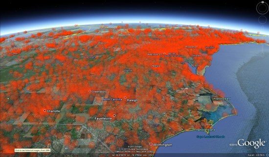
uses transparent spheres with volumeric values, similar to the demos we have seen from DataAppeal in the past.
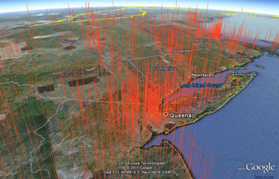
 

volumetric.jpg 

Their second KMZ file shows the data with tall orange spikes, built using real data with dramatized height.


earth-quake-nyc-int.jpg 

These files are a great example of what companies like DataAppeal are capable of, as well an excellent way to show how fast they work. Being able to plug data into a system like that and get these kinds of results could be a powerful tool for a lot of organizations.

SketchUp: Discover Your World in 3D

Today, we’re unveiling a totally redesigned Your World in 3D website. If you’re new to geo-modeling — the term given to creating 3D buildings for Google Earth and Google Maps — the Your World in 3D website has all the tools and info you’ll need to get up and running quickly. The new website showcases several examples of what fellow modelers are building and will help connect with other geo-modelers around the world.

So that’s the what, here’s the why. Five years ago, Google acquired a Boulder-based startup called @Last Software, which was making waves in the architectural world with their 3D modeling software, SketchUp. Google had an ambitious idea to add a 3D model of every building on the planet to Google Earth, and SketchUp was a tool up to the task. Not only that, by opening SketchUp to a wider audience, users would have the opportunity to help build a virtual mirror of their world.

Times Square showcases some of the very first user contributed models

Today, the 3D virtual world is in full bloom: hundreds upon hundreds of villages, towns, and cities have been added to the 3D map representing hundreds of thousands of 3D buildings from every corner of the globe — truly, a testament to the power of open collaboration.

In the intervening half decade, we’ve introduced several new ways of adding buildings to the 3D map, including Google Building Maker and the Cities in 3D program. And you may have noticed 3D buildings surfacing on Google Maps and Google Maps for mobile as well. With so many different ways of creating and viewing 3D models, we realized we needed a destination that would demystify the process of geo-modeling,

Enter: the new Your World in 3D website. We call the website Your World in 3D because it is you, the user, who is helping build this virtual world, and perhaps more importantly, it is you who is finding innovative and surprising ways of using this data.

Your World in 3D has been redesigned from the ground up

Why geo-model? When asked, most geo-modelers say they do it because geo-modeling is just plain fun, but building your town in 3D can also be a great way to show civic pride and encourage tourism for your town. It can also provide an interactive way to promote your business or contextualize the urban planning. 3D modeling has also been used in crisis response situations as we saw in the grassroots modeling effort that happened after the earthquake in L’Aquila, Italy.

Artistic 3D Visualizations

Today I want to highlight the work of the Senseable Lab at MIT, from a brief review of their work I’d say they seem to specialise in the area of real time 3D visualization and sensor input.

Beautiful Design Ideas: From an artistic ‘this is a work of art’ point of view their ideas are novel, fun and highly engaging, see this TED talk for examples
I really relate to the water building, I hang out on the South Bank in London and there’s a similar water sculpture there that is hugely popular (clip). Also, I’d LOVE to have some of those helicopter pixels in my lectures to illustrate geography concepts like earthquake waves to students.
Artistic 3D Visualizations of Singapore: This year the Sensable team have produced a project collecting real time data from Singapore and visualizing it. Here are some examples as a clip:


Looking from the angle of information communication there’s lots to like:
  • Engaging animations. The graphics draw the viewer in to find out more, they’re certainly engaging and artistically beautiful. I’m sure their exhibition at Singapore Art Museum was a sucess.
  • Elegant Time lines: They show time as a playhead moving against a timeline or against a bar chart illustrating relevant data. These elegant graphics are minimalist and communicate effectively without making the animation too busy visually. In a lot of ways they remind me of Tufte’s sparklines.
  • 3D Data Visualized Well? I’ve previously praised their technique in the of visualising 3D data using altitude, color and opacity at the same time as a way of getting over the problems of 3D thematic maps.
Beautiful but Ineffective? However, I worry that beyond looking attractive, these visualisations fail to communicate the data effectively. Two example issues that occurred to me:
  • Double 3D = Busy: In the heat vs energy consumption visualisation I think trying to show 2 sets of 3D data at once with the top layer of data partly obscuring the bottom layer doesn’t work well.
  • Where’s the Rain?: In the rainfall taxi visualisation by having the rain plot in 3D above the ground its difficult to relate where its actually falling on the ground.

I raise these issues without any evidence that they are actually problems, the only way of doing that is to conduct users tests. On the research page of the Singapore project Sensable discuss technical innovations and I admit in a real time visualisation project these are significant and important. However, there is no mention of user tests, given the amount of time and money that has gone into producing these animations wouldn’t it be a good idea to find out if they actually work?

Earthquake Risk vs. Population

Global Earthquake Intensity

This map compares historical seismic activity on a gridded equal-population cartogram: the colours show past earthquake activity; the map is distorted by population. “The resulting map,” says the press release, “gives each person living on earth the same amount of space while also preserving the geographical reference. The map does not only show the areas that are at highest risk, but also how this risk relates to global population distribution.” More at Views of the World.