Earthquake Risk vs. Population

Global Earthquake Intensity

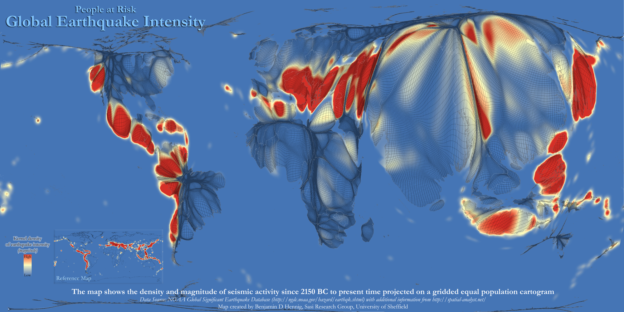
This map compares historical seismic activity on a gridded equal-population cartogram: the colours show past earthquake activity; the map is distorted by population. “The resulting map,” says the press release, “gives each person living on earth the same amount of space while also preserving the geographical reference. The map does not only show the areas that are at highest risk, but also how this risk relates to global population distribution.” More at Views of the World.

The Globe and Mail’s 50 Ridings to Watch

Globe and Mail: 50 Ridings to Watch

Last Saturday’s Globe and Mail ran a feature looking at 50 electoral districts to watch in the Canadian federal election now under way. The print infographic (above) differs from the online version, which is a Google Maps mashup with pushpins. In neither case does the Globe use geographically accurate maps of the ridings, which makes sense: large rural ridings are worth as much as compact urban districts.