There is a saying “Half the money spent on advertising is wasted; the trouble is you don’t know which half.” The statement attributed to John Wanamaker, who is considered to be the father of modern advertising, illustrates how difficult it is for a business to come up with an optimal advertising strategy that will deliver maximum results, at the minimum cost, and with minimum wastage.
If you try using “a bit of everything” you are spreading your resources too thinly. Focus too much on a single advertising channel and you are potentially missing out on some big opportunities elsewhere.
For example, online social media engagement for promotion of business is the latest communication channel rapidly gaining in popularity (and hype) but should it be the only channel? Will it deliver in your line of business and for your geographic market? It’s one of those dilemmas: “damn if you don’t engage, damn if you do…” so, one way of prioritising which advertising and promotional options to pursue is to compare alternatives based on total reach, proportion of target population reachable through the channel, duration and timing of exposure, and overall costs involved.
Although the optimal mix of advertising and promotional activities will depend on what you are selling, the target audience you are pursuing (ie. whether global or local) and the scale of you operations, however there is one simple activity that should always be seriously considered – contacting your potential clients directly (either cold calling, sending snail-mail or just arranging for letterbox drops). Why? Because of simplicity of implementation of this option. And not to mention that the campaign can be personalised, can be localised (either for testing or to stage a rollout if your budget or response handling capacity is limited), you can easily measure the results and it can be very inexpensive.
The rest of this article is a case study on how maps and simple spatial analysis techniques can improve efficiency of direct marketing activities and ultimately, sales results. Traditionally, such methods have been restricted to only large companies due to the cost of analytical tools and/or specific skill set required to undertake the analysis. However, with the advent of free mapping solutions and increasing volumes of free data liberated by State and Federal governments with Creative Commons licensing, the capability to undertake spatial analysis is well within reach of business enterprises of any size.
Case Study
Challenge: Your target market is property investors in Canberra and you have a budget for a letterbox drop of promotional materials about investment loan refinancing options to 10,000 prospects. Your objective is to maximise effectiveness of the campaign (ie. get the best return on your bucks!).
Solution: The key to the success of your campaign is to know which are the areas that offer the best opportunity to reach your target audience. The easiest way out would be just to pick the most affluent postcodes and do your mailbox drops there. But is this the optimal approach? And which are those “affluent postcodes’?
There is a good range of free information available from the Australian Bureau of Statistics that could help with the campaign but for this particular campaign there is even better free data source: statistics on personal returns from the Australian Taxation Office that show numbers of property investors in each postcode.
Equipped with that data you can do a simple analysis classifying and sorting the postcodes based on a couple of variables: overall proportions of people claiming rental investment expenses in each postcode and the value of their claims in relation to the ACT average. This will allow to pinpoint specific postcodes with the highest probability of reaching the target audience (ie. the highest proportion of taxpayers claiming the highest loses).
Focusing just on the postcodes with the largest number of property investors is not the most optimal approach since population counts in each postcode vary dramatically. So, the absolute number of investors in a given postcode may be high but proportionally to the overall number of people in that postcode, there may not be many prospects there. And besides, you would also want to find people with the largest mortgages to optimise your efforts. Therefore, that extra analytical step can be very beneficial. This way it is possible to derive a meaningful ranking measure of postcodes based on the concentration of people with sought after characteristics in each postcode.
Mapping the results will help to visualise the location of your target audience and to manage distribution of promotional materials. Thematic map shown below is an illustration of the outcome of a simple analysis outlined above and shows detailed boundaries of target postal areas (dark red polygons indicate areas with highest concentration of target audience).
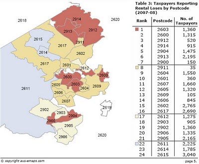
Conclusion: The campaign should focus on postcodes 2600 and 2603 (with approximate number of 10,500 taxpayers and 2,675 total potential clients). Targeting these postcodes will give you the most optimal, 1 in 4 chance, to reach your audience.
This case study demonstrates that running campaigns in an ad hoc manner cannot deliver optimised outcomes. Even if you have limited resources, simple analysis and mapping of the results can help immensely in maximising the return on your efforts.

 .
.