Placemark Clustering Investigation

First of all I’ll start by making a point by considering a couple of examples of the development of everyday technologies:

College Dropout changes Computer text: The text you’re reading on screen would be very different were it not for the actions of a student dropout. Steve Jobs dropped out of Reed college but, because it interested him, still attended a class in calligraphy. The techniques he learnt, about elegant letter spacing and formats, were later applied to the Mac and from there were copied by windows. We’ve all benefited from Steve’s nerdy love of text.

Spam Email didn’t have to exist: Email was invented early in the history of the internet but because everyone then knew each other by name, no one bothered to produce code in email programs that checked the ID of senders. We all suffer because this didn’t happen, the internet is swamped by spam email traffic that could have been avoided. Google Wave was an attempt to get us all off email to avoid this sort of problem, it didn’t take off despite having the promotional weight of Google behind it.

Get Technology right early on: My point is that its incredibly important to try and get early technology right otherwise you may never be able to correct it. One of the issues I see like this in web mapping is the clustering of points, if we get it wrong now we may never be able to undo it and we will end up using sub optimal visualisation techniques just because we’ve always done it.

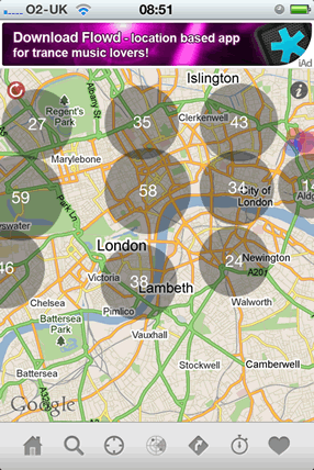
Clustering Placemarks: Previously I’ve written about the problem, placemarks need clustering because at a certain density of points it is becomes impossible to pick individual points out. IMHO some of the ways of visualising these are poorly designed e.g. clustering placemarks into ‘blobs’ with numbers.

It may be that numbered blobs work as a way of clustering placemarks – maybe users immediatly get the concept of a large blob being a cluster and that outweighs other problems I’ve identified. But what worries me is that this technique is all over the place in web maps and no one has actually done any user testing to show that its effective.

Enter my new MSc student Craig who’s doing his project on this map visualisation. By doing a series of user tests we hope to answer the questions:

* Does blob clustering work compared with other techniques?
* If not, can we adapt it so it does?

Wider Point: This isn’t the only example of a technique that is being widely used in web maps without being user tested (anyone for 3D thematic maps?) so I think Craig’s work will also be important in promoting the more general idea that we need usability testing in web maps. At the moment I think web programmers are applying these untested techniques because they think the look flash and/or they are easy to apply because the software needed is readily available.

Dreamweaver for Google Earth

I noticed that Declan wrote up an idea we kicked around in September (see ‘September’ on the DigitalPlanet pages), so I thought it deserved a post. I referred to it then as ‘Dreamweaver for KML.
Image courtesy of favbrowser. A bit out of date but still interesting.

Browser History: In 1997 Netscape adds a feature to its Netscape communicator browser that allowed for WYSIWYG simple production of html web pages. To put that in context you have to recall that this was the late days of the browser wars between Microsoft and Netscape. Then in March 1998 Macromedia release dreamweaver 1, this allowed web pages to be created in WYSIWYG or code views and produced short cuts that produced elegant html. It was also extensible so you could write a ‘macro’ to produce custom HTML. Developers loved it.

Geo-Browser History: My point is that if you regard GEarth as a geo-browser then the history is similar. Today in GEarth you can create simple maps and tours just like in Netscape communicator you could create simple web pages. However, a lot of sophisticated features such as time, region control, pauses in tours need to be hand coded into the KML. There are a few tools out there that allow you to produce KML without hand coding such as the spreadsheet mapper, my spreadsheet for adding loops and a tool for adding screen overlays but these are all limited in scope.
Tool Description: An obvious improvement would be ‘Dreamweaver for Google Earth’, where all this functionality was combined into one specialist KML producing program just as dreamweaver was a specialist HTML producing program. It would need to be:
  • WYSIWYG, ie be able to write code directly or using wizards and then see the result in an instance of the GE API
  • Extensible allowing you to write an extension that produced your favourite snippet of KML structure.
  • Elegant, highly usable and producing well formed KML code
So what should its wizards allow you to produce? My list would be:
  • Time control
  • Screen Overlays
  • Functionality producing usable maps e.g. color palettes that avoid color blindness issues
  • Simple sketchup models such as a photo billboard
  • Region controls
as well as enhancements to editing tools that are already available in GEarth such as better polygon digitising controls.
Flash Editor for Google Earth? So why haven’t I mentioned tours yet? Well, I think the analogy here is with FutureSplash Animator (later ‘Flash’) released by Macromedia in 1996 which was a timeline based tool for producing animations on the web. It pre-dated Macromedia Dreamweaver and was kept separate. To me, it makes sense that a Google Earth tour is an animation so it needs a separate animation editing tool that is timeline based, I explain in more detail here (although I discuss it by comparison Captivate, another timeline based tool).
So Why aren’t you Building these programs then? because if I did, and it was a sucess, a certain company ending with ‘Oogle’ and beginning with ‘G’ would bring out a rival and completely blow me out of the water. Instead this is a lazy web request.

Blog Break and Infographics in the Media

After slogging my way through the summer while all my colleagues took leave I’m about to take 3 weeks off myself to sort some things at home and holiday abroad. I haven’t been posting much because of trying to kick a few projects into shape before leaving them for a while. I’ll be back 2nd week of December.

I’ll leave you with a fascinating set of videos I’ve found by Geoff McGee for a fellowship he completed at Stanford University. Its about data visualisation as a story telling medium and focusses on graphics in the media. What’s interesting about it is the same problems I’ve noticed in using neo-geo tools in education and outreach come up in their topic area. Points that particularly resonate with me:
  • Martini Glass Presentation: The importance of an introduction, context setting and explanation of what you can ‘do’ with an interactive web graphic or complex print graphic (section III: Telling Data Stories). Without this, your creation is just a set of pretty colours to the user. The Martini glass stem represents the video clip slide presentation introduction and the triangular glass represents the freedom of the user to explore the graphic on their own.
  • Attractive Does Not = Effective: A beautiful looking stream graphic showing box office results for movies with time is discussed in part IV, various commentators point out that it grabs attention wonderfully but then is difficult to interpret what it shows.