This user story comes from Mark Lessmueller at Daniel Company. It came in via the Tell us your story link on the Sketchup Go Green! site.
Daniel Company has switched to Sketchup Pro for the drafting, design, analysis and construction of its air pollution control systems. Sketchup Pro has helped us visualize potential problems in 3D, allowing us to find conflicts on the computer, rather than in the field. This prevents us from wasting material and resources and reduces our carbon footprint. In addition, we can share our drawings and models with anyone across the globe. They can make suggestions directly on the drawings without having to resort to awkward phone conversations about “what change needs to be implemented where”.
This simplicity allows our clients to ensure that there are no intersections with existing equipment onsite during modifications. Additionally, due to the low cost of Sketchup Pro (especially in comparison to similar products), we were able to install Sketchup Pro on virtually all of our engineering computers, rather than just the drafters’ machines. The ability for our engineers to do some of our drafting when the drawings are “bottlenecking” production has proven invaluable.
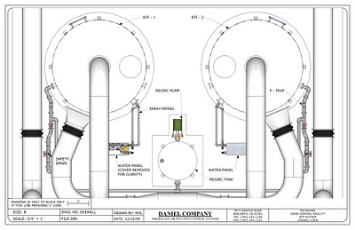
We are about to begin start-up of the first system we created with SketchUp: a biological system where microorganisms digest the odorous pollutants. The system relies entirely on wastewater treatment plant products to feed the bacteria, rather than the typical method of spraying highly reactive neutralizing chemicals into the polluted airstream. The resultant waste of the bacteria can then be conveyed back into the wastewater treatment plant and treated via the microbes in that system.
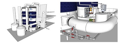
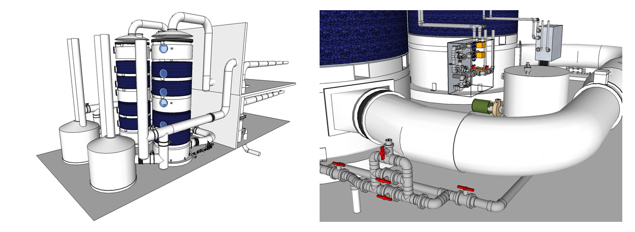
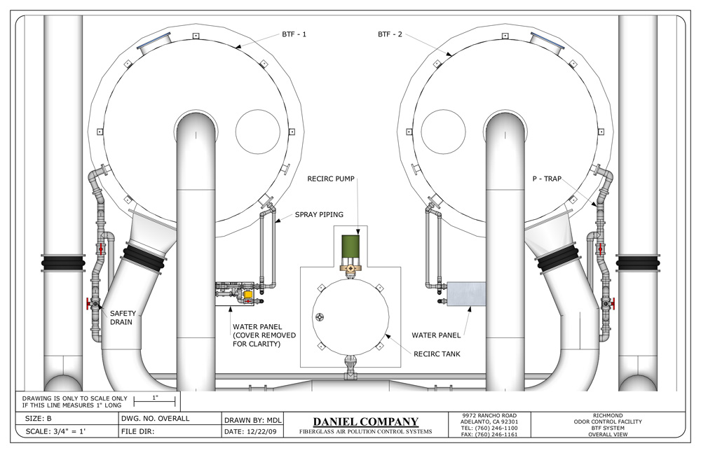
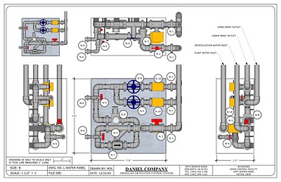
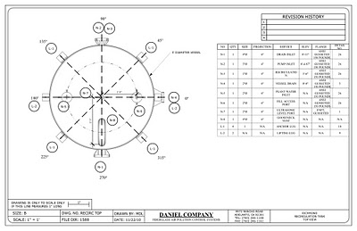
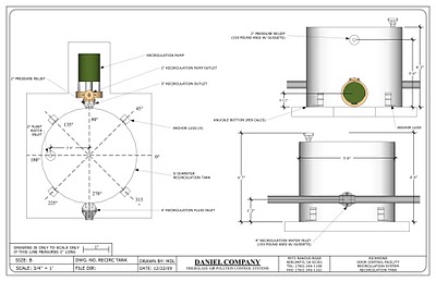
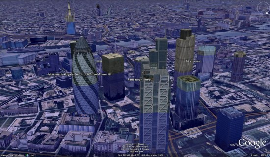
While the air pollution control system was originally conceived by the treatment plant’s design consultant engineer, the actual odor control system manufacture was drafted, designed, analyzed, and constructed using Sketchup and LayOut. This includes an air conveyance system, hydraulic profiles, plumbing layouts, water control panels, two 12′ Ø x 40′ tall fiberglass reactors, and two 12′ Ø x 20′ tall fiberglass adsorbers. (Each of the 12′ Ø vessels was made in our shop in accordance to the LayOut files.) As the system is starting up, we are also planning to visualize this model in Google Earth.
Each of the pieces of the ducting (which supplies fresh air to the building and captures the foul air) was modeled in SketchUp and then turned into a cut sheet. Our fiberglass duct, tank, and scrubber shop easily fabricated the individual pieces. Thanks to Sketchup, it is a lot easier to make sure that each piece will fit on a truck (sent from California to Virginia), rather than relying on 2D drafting.
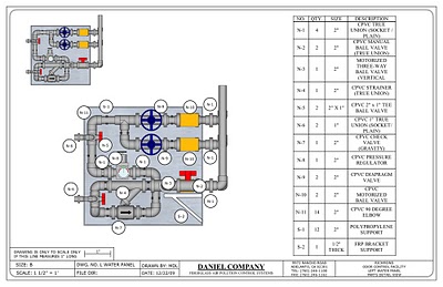
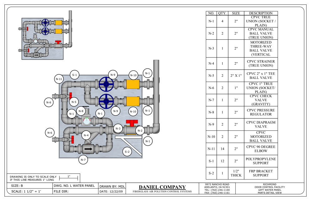
Since this was our first major project in SketchUp, most of it was created using the standard SketchUp tools. The plugins we did use were mostly custom modifications of plugins that were available for alteration. The CenterPoint and Conetop plugins were used to help make pipe transitions and to align pipes. We modified the Mesh Additions and the Parametric scripts to create an “elbow tool”. The PVC piping in the water panels was created with a combination of native SketchUp tools, this “elbow tool” plugin and the CenterPoint plugin.
Since this project, we have created multiple other air pollution control projects using SketchUp and LayOut. We’ve also used quite a few other freeware plugins. (We’re big fans of Fredo6 and Chris Fullmer’s plugins). FredoScale and Joint Push Pull have saved us on a number of more delicate projects, especially where we make a small apparatus and then need to show thickness in the ducting, or building our damper library. And Chris Fullmer’s Shape Bender has helped out quite a bit for other jobs where nothing else seems to work.
We’re now working to model some of our older existing projects in SketchUp and visualize them in Google Earth.
Thanks for sharing your work, Mark!
 .
.