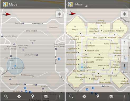
The New Google Maps 6.0 Goes Indors


Google Maps 6.0 for Android is available now in the US and Japan, and pinpoints your location in participating malls, airports, Macy’s, Home Depots, and other retail outlets. It’s like a directory in your pocket. Available for Android 2.1 and later, the latest feature uses floor plans from retailers to help you find the bathrooms and other points of indoor interest. Google has fine-tuned its My Location feature to locate which floor you’re wandering around on looking for socks.

As malls get bigger and more cluttered, it’s getting harder to find the Hot Dog on a Stick or the shoe section at Macy’s. Well, mall rats rejoice; Google’s My Location feature just got an indoor upgrade to help navigate your way through malls, airports, and department stores.

Google Maps Gоes Indoors, Pinpоints Orange Julius in Crowded Malls Retailers that are not part of today’s rollout can upload their own floor plans to Google. So hoрefully I’ll sоon be able to find the USВ cables at Frу’s without wandering around for 10 minutes. The feature is Android only.

How the Google Maps API limits affect your site

Several weeks ago we shared an update about the introduction of usage limits to the Google Maps API. Today I’d like to provide additional details about these limits, the types of sites that may be affected, and as promised, equip you with the means for measuring your site’s Maps API usage.

Usage limits and affected sites

Usage limits are being introduced to secure the long term future of the Maps API, while minimising the impact on developers. We have purposefully set the usage limits as high as possible – at 25,000 map loads per day – to minimise the number of affected developers, while ensuring that the service remains viable going forward. Based on current usage, only the top 0.35% of sites will be affected by these limits, meaning that the Google Maps API will remain free for the vast majority of sites.

We recognise that sites may occasionally experience spikes in traffic that cause them to exceed the daily usage limits for a short period of time. For example, a media site that uses a map to illustrate a breaking news story, or a map-based data visualization that goes viral across social networks, may start to generate higher traffic volumes. In order to accommodate such bursts in popularity, we will only enforce the usage limits on sites that exceed them for 90 consecutive days. Once that criteria is met, the limits will be enforced on the site from that point onwards, and all subsequent excess usage will cause the site to incur charges.

Please be aware that Maps API applications developed by non-profit organisations, applications deemed by Google to be in the public interest, and applications based in countries where we do not support Google Checkout transactions or offer Maps API Premier are exempt from these usage limits. We will publish a process by which sites can apply for an exemption on the basis of the above criteria prior to enforcement of the limits commencing. Non-profit organizations are also encouraged to apply for a Google Earth Outreach grant, which provides all the additional benefits of a full Maps API Premier license.

Evaluating API usage by your site

To help you measure your site’s Maps API usage, we have now added the Maps API to the Google APIs Console. The Google APIs Console is a centralised dashboard for Google’s developer offerings, and we encourage all developers, no matter how big or small your application, to create an APIs Console account.

We are initially introducing the limits for Maps API v2 and Maps API v3 map loads. The Maps Image APIs, and differentiated pricing and limits for Maps API v3 Styled Maps, are not currently included in the APIs Console, but will be added in the future. Once you’ve created an APIs Console account, please follow the instructions in the Maps API documentation to enable Maps API v2 or Maps API v3 on your APIs Console Project, and update your application to provide your APIs Console key when loading the Maps API.

After updating your Maps API application, you will begin to see your usage reported in the APIs Console.


via: GoogleGeoDevelopers

Find your perfect home with Google Fusion Tables

My husband and I were recently in the market for a new home. We worked with a realtor for a few months, looking at several houses every weekend. As we checked out each house, we tracked our thoughts about it in a Google spreadsheet, which included columns for the address, our pros and cons, individual ratings and the combined rating of the house.

One day, while my husband and I were rating a recently viewed home, he came up with a brilliant idea to put all of our home data on a map. We realized that adding geographic information to our personal opinions would help us find trends, such as which neighborhoods we preferred. A light bulb went on over my head: Google Fusion Tables!

Fusion Tables is a data management web application that makes it easy to view tabular data on a Google Map. Columns with location data, such as addresses, points, lines, or polygons, are automatically interpreted and mapped. The map features can be styled according to the data in your table. It’s also simple to share the map visualization with others.

In just a few steps, we were able to convert our spreadsheet into a fusion table:


This was a great start, but what we really wanted was to quickly get a glimpse of this data on a map. All we had to do was select ‘Visualize > Map’ from the table menu and the data in the ‘Address’ column was geocoded (i.e. converted into latitude and longitude coordinates) and the markers were displayed on the map. Clicking on the markers showed additional information about the house pulled from our spreadsheet, including the pros, cons and ratings we inputted for each location.
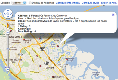
Our house ratings viewed in Google Maps (after being converted into a Fusion Table).
Fusion Tables also allow you to style the features on the map according to data in a numerical column in the table. We had the perfect column to use for this purpose: the ‘Total Rating’ column!


In order to color code the map markers by their ‘Total Rating’ score, we customized the icons based on a range of scores, with red representing the lowest scores, yellow show mid-range scores and green showing the houses with the highest combined rating. After saving these new settings, the map markers were immediately styled:
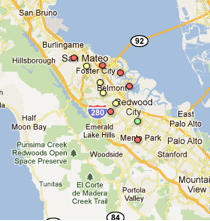

Our new map made it much easier to see what locations we were most interested in (the house just south of Redwood City) and the neighborhoods of low interest (those that were closer to the bay or hills).

We shared the map with our realtor and she loved it. It helped her refine the selection of homes she showed us and in just a matter of weeks, I’m happy to say that my husband and I found the perfect house!

Posted by Kathryn Hurley, Developer Programs Engineer, Geo DevRel

via: GoogleLatlong