Beautiful & interactive maps faster with the Fusion Tables API

Google Fusion Tables is a modern data management and publishing web application that makes it easy to host, manage, collaborate on, visualize, and publish data tables online. Since we first launched Fusion Tables almost two years ago, we’ve seen tremendous interest and usage from dozens of areas, from journalists to scientists to open-data entrepreneurs, and have been excited to see the innovative applications that our users have been able to rapidly build and publish.

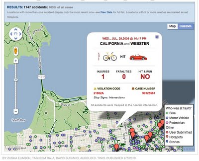
We’ve been working hard to enrich what Fusion Tables offers for customization and control of visual presentation. This past fall we added the ability to style the colors and icons of mapped data with a few clicks in the Fusion Tables web app. This spring we made it easy to use HTML and customize what users see in the info window that appears after a click on the map. We’ve enjoyed seeing the impressive visualizations you have created. Some, like the Guardian’s map of deprivation in the UK, were created strictly within the web app, while apps like the Bay Citizen’s Bike Accident tracker and the Texas Tribune’s Census 2010 interactive map take advantage of the Fusion Tables SQL API to do even more customization.

Of course, it’s not always convenient to do everything through a web interface, and today we’re delighted to invite trusted testers to try out the new Fusion Tables Styling and Info Window API. Now developers will be able to set a table’s map colors and info windows with code.

Even better, this new Styling and Info Window API will be part of the Google APIs Console. The Google APIs Console helps you manage projects and teams, provision access quotas, and view analytics and metrics on your API usage. It also offers sample code that supports the OAuth 2.0 client key management flow you need to build secure apps for your users.

So if you’ve been looking for a way to programmatically create highly-customizable map visualizations from data tables, check out our new APIs and let us know what you think! To become a trusted tester, please apply to join the Google Group and tell us a little bit about how you use the Fusion Tables API.
Julia meets HTML 5

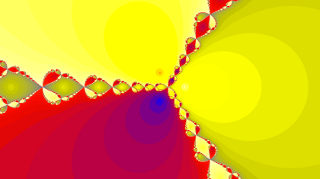
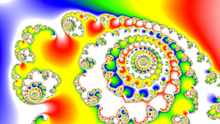
Today, we launched Julia Map on Google Labs, a fractal renderer in HTML 5. Julia sets are fractals that were studied by the French mathematician Gaston Julia in the early 1920s. Fifty years later, Benoît Mandelbrot studied the set z2 − c and popularized it by generating the first computer visualisation. Generating these images requires heavy computation resources. Modern browsers have optimized JavaScript execution up to the point where it is now possible to render in a browser fractals like Julia sets almost instantly.

Julia Map uses the Google Maps API to zoom and pan into the fractals. The images are computed with HTML 5 canvas. Each image generally requires millions of floating point operations. Web workers spread the heavy calculations on all cores of the machine.

We hope you will enjoy exploring the different Julia sets, and share the URLs of the most artistic images you discovered. See what others have posted on Twitter under hashtag #juliamap. Click on the images below to dive in to infinity! (Supported on Chrome 8, Firefox 3.6, Safari 5 and above).

Posted by Daniel Wolf, Software Engineer

Map your data with the Maps API and Fusion Tables

If you have ever tried to plot a very large number of overlays on an API map you have probably reached a point at which the performance of your application begins to suffer. With one hundred or so markers, most browsers cope just fine, and clustering solutions like Fluster can help support more. But if you have thousands of overlays that you wish to show, rendering them individually can be problematic.

The Maps API v3 now offers two solutions to this problem. If you have a large volume of geospatial data that can be served as KML, the KmlLayer class can render up to 50,000 features as an overlay that does not impact performance on any browser. To support data sets that are structured as tables, such as a database or spreadsheet, we have also now added the FusionTablesLayer class for rendering data stored in Google Fusion Tables.

Google Fusion Tables is a fascinating new experimental Google Research project offering storage, search, and management of large structured data sets in the cloud. Up to 100MB of data can be stored per table, and each row in a table can have an associated location, line, or polygon feature. Using the FusionTablesLayer class you can render features on an API map as a clickable overlay. When a feature is clicked, the application can access a copy of the complete row of data associated with the feature.

Fusion Tables also supports an SQL like query language, which you can use to filter the features shown on a map. The below map visualises mountain biking trails uploaded to Fusion Tables by mtbguru.com. The slider allows you to filter trails by their length, and the trails shown on the map are updated accordingly. If you click on a trail a custom dialog is shown which indicates the elevation profile for the trail concerned.

The FusionTablesLayer also supports rendering data sets as a heatmap. The below map of beaches in Brazil illustrates the benefit of this. When rendered as point features it is difficult to tell the relative density of the beaches without zooming in further. However once you switch to displaying the data as a heatmap the high density of beaches west of Rio de Janeiro becomes immediately clear.

The combination of Fusion Tables with the Maps API makes it easy to host large sets of data in the cloud, and visualise them in your Maps API application. It is quick and simple to get up and running with Fusion Tables, and the addition of the FusionTableLayer class to Maps API v3 enables Maps applications to be tightly coupled with data hosted in Fusion Tables. Give it a try, and let us know what you think of this experiment in the Groups!

Posted by Thor Mitchell, Maps API Product Manager