Bing Maps: “The Hurricane Season”


The term ‘hurricane season’ recently brought new meaning to many communities across the U.S. East Coast in the wake of Hurricane Irene.  Being able to see the latest developments and impacted locations online through Bing Maps makes it possible to better anticipate, respond and recover from the destruction of hurricanes.

Around the world, people use Microsoft technology every day to stay in touch during difficult times. Today, we’re calling out a Bing Maps app launched by the Wall Street Journal that tracks hurricanes in the Atlantic Ocean. Tech geek or not, you have to admit this is a useful app, especially now during hurricane season. Let’s take a closer look.


The app is an interactive graphic that charts both current hurricanes as they are happening, and chronicles previous hurricanes dating back to 2005. So if you’ve always wanted to be a weatherman, you can bookmark the link and visit it often to see the latest weather patterns – hurricane season or not. The app is easy to use, so no meteorology degree is required.

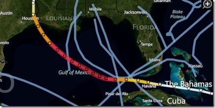
To watch a current storm’s path, you can follow it from the moment your browser opens to the app. The storms strength is categorized on the right hand side of the screen so you can see the severity of the storm and the route it is predicted to take.  Here, we see an example of a storm pattern that started near the Bahamas as a tropical storm and as it grew stronger it became a Category 5 making its way up through the Gulf of Mexico. As it got closer to the Gulf Coast it became less intense, still remaining a Category 3 and then tapering off back to a tropical storm status.


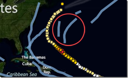
To see a past hurricane, just click on one of the blue lines and it will take you to the storm’s history and the calendar at the top will move to the month it happened.


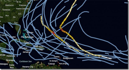
With Bing Maps, it’s easy to zoom in and out by scrolling your mouse so you can zoom in to see high-levels of detail or zoom out to see the past patterns of multiple hurricanes in the Atlantic.


For you self-proclaimed geeks, here’s more on how the app was built and all the things it can do:

Bing Maps’ partner, OnTerra built the hurricane tracker working closely with the Wall Street Journal team. It was created using the Bing Maps AJAX7 API, JQuery and JavaScript. It gets data from NOAA which is processed into JSON data files and refreshed every few hours, which includes the hurricane path, predicted path and the cone of uncertainty polygons. The application works great on modern web browsers including iPhone, iPAD, Android and Blackberry devices, unlike Flash and Silverlight applications. The HTML5 support in the AJAX7 API provides solid mobile device integration for interactive mapping apps like the Wall Street Journal Hurricane Tracker.

Public data visualization with Google Maps and Fusion Tables

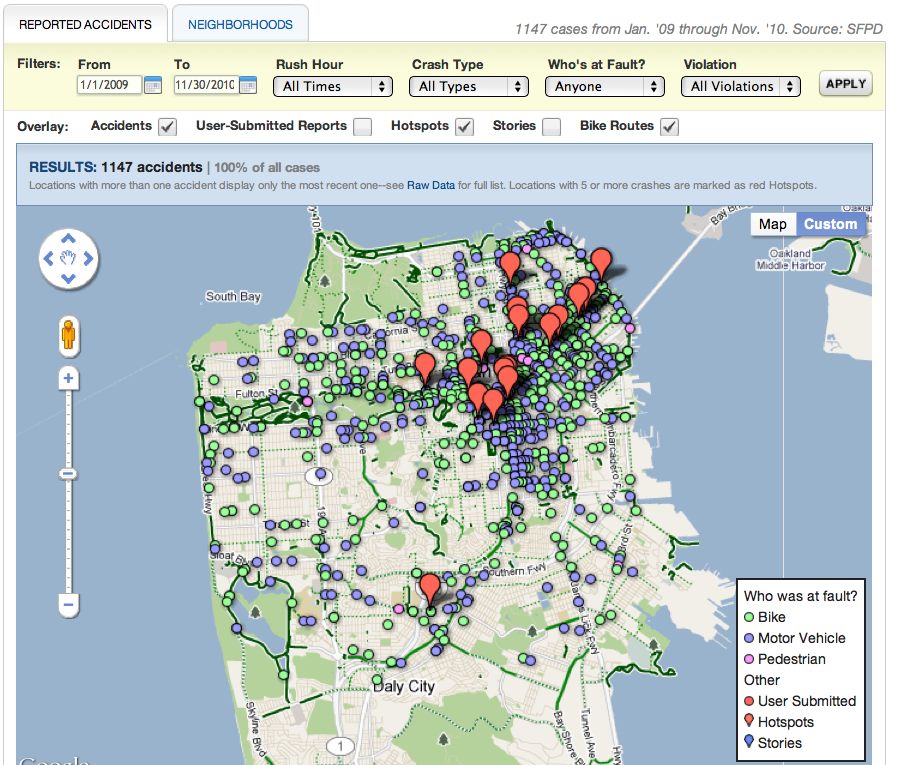
The Bay Citizen is a nonprofit, nonpartisan news organization dedicated to fact-based, independent reporting of issues in the San Francisco Bay Area. We are interested in visualizing public data that is useful to the local community. One such effort is our Bike Accident Tracker. In this post, I’ll present a simple example of how we used Google Maps and Google Fusion Tables to accomplish this.

This is what our accident map looks like:

Want to add our accident map to your site? Here is the code:

[php]<html style=’height: 100%’>
<head>
<script type=’text/javascript’ src=’http://maps.google.com/maps/api/js?sensor=false’></script>
<script type=’text/javascript’>
function initialize() {
var bc_office = new google.maps.LatLng(37.788901, -122.403806);
var map = new google.maps.Map(document.getElementById(‘accident-map’), {
center: bc_office,
zoom: 13,
mapTypeId: google.maps.MapTypeId.ROADMAP
});
var accidents_layer = new google.maps.FusionTablesLayer(433634);
accidents_layer.setMap(map);
}
</script>
</head>
<body onload=’initialize()’ style=’height: 100%; margin: 0px; padding: 0px’>
<div id="accident-map" style=’height: 100%’></div>
</body>
</html>[/php]

That’s it. To test this yourself, just save the raw file, open the file with a browser and you will have a copy of the accidents map running locally on your computer. The code mainly deals with setting up Google Maps, with one critical line that sets up Fusion Table integration:

[php]var accidents_layer = new google.maps.FusionTablesLayer(433634);[/php]

You can expand this integration by filtering the results through the use of Fusion Tables’ sql-like query syntax. As an example, to display accidents from May 2009, change the line above to look like this:

[php]var accidents_layer = new google.maps.FusionTablesLayer(433634, {
query: ‘SELECT FullAddress FROM 433634 WHERE Year=2009 AND Month=5’
});[/php]

A quick gotcha to point out here is that Google Maps v3 only supports a SELECT operation on the location value column. So the location query above works just fine, but the COUNT query needed to get the number of accidents does not work:

[php]’SELECT COUNT() FROM 433634 WHERE Year=2009 AND Month=5′[/php]

Instead, to get the number of accidents in this case, you can use the Fusion Tables API endpoint directly:

[php]https://www.google.com/fusiontables/api/query?sql=SELECT COUNT() FROM 433634 WHERE Year=2009 AND Month=5[/php]

You can see the actual response from the count query here. Because The Bay Citizen is built on the Django framework, we can leverage the Python libraries Google provides for query generation and API calls. Also, since the location query is so similar to the count query, I consolidated the filter logic so it happens on the server side using a jQuery AJAX call. As a result, when users apply a filter, they see an updated map and results bar all thanks to the following few JavaScript lines:

[php]$(‘#filter-form’).ajaxForm({
success: function(responseText, statusText) {
var data = $.parseJSON(responseText);
accidents_layer.setMap(null);
accidents_layer = new google.maps.FusionTablesLayer(433634, {
query: data.map_query});
accidents_layer.setMap(map);
$(‘#filter-results’).html(data.results);
}
});[/php]

I was really happy with this approach. The performance hit is negligible, the code is much cleaner, and the filter logic is rewritten in the programming language I currently know best (Python).

I hope this post gives you a taste of what it’s like to work with Google Maps and Fusion Tables. Also, please note that our data is public and can be referenced at Table #433634. This means you’re free to use the same data we do to develop and design your own map interface. When we update the data, your project will be updated as well.

From our end, we don’t have to worry about our servers being overloaded with data API and map generation calls that come from your project. So by all means, hack away, improve the design, and create a better version. All we ask is that if you do come up with something cool, please link back to us, let us know, and then maybe we can even work together.