The University of Alberta

We’re big fans of 3D buildings and the realism that they add to Google Earth, and universities around the world are continuing to be the leaders in that area. Recently we showed you Terbuka University in Indonesia, and previously we’ve shown you excellent 3D campuses from Northeastern, the University of Wisonsin-Fox Valley, Central Florida and dozens of others.

Today we’ll take a look at the University of Alberta. Lawrence Kwok emailed us to let us know that a team of himself and three other students (Max Amerongen, Matthew Hale and Veronica Krawcewicz) have modeled the majority of the campus, and it’s looking great!

u-a.jpg

While the buildings are looking excellent, they’re far from finished. This summer they’re working through an initiative to redesign the online campus map. While the map currently has quite a lot of data in it already, they’re hoping to improve the mobile experience.

To explore their 3D buildings for yourself, you can visit this page on Google Maps or download this KML file to fly directly to it in Google Earth.

via: GoogleEarthBlog
MapMyFITNESS and Google Maps API for Business

Being fit means moving and moving means going someplace. We created the MapMyFITNESS applications because we are passionate about living active lifestyles and we wanted a way to both track our progress and explore new activities. We wanted to help people experience this passion for themselves. As our community of MapMyFITNESS users has grown to over 9 million people, we have continually worked to make the applications easier to use and more effective at motivating people to keep moving, whether they’re elite athletes or people just getting started.

A key component to that mission has been our integration with Google Maps, which has made it easy for our users to find new routes or make their own, then share them with the rest of the MapMyFITNESS community. As one of the earliest Google Maps API developers, we noticed it was easy to incorporate the mapping functionality into our product. As we set about to completely rebuild our platform that launched earlier this month, our goal was to expand the ways users could take advantage of Google Maps’ latest API functionality. We’ve gone from tracking and sharing routes in our old platform to providing “Courses” in our new platform. Courses provide our users with real-time data like traffic patterns and temperature, and include “check-in” technology that helps them track workouts, share their progress, and compete in our new leaderboard against specific groups of people. They can compete with local clubs, friends, and most importantly against themselves and their own progress.

The Google Maps API allowed us to show the important information to our users in an easy to read format. Users can visit our site to find new cycling, running or walking routes by searching for the route while viewing it on the map. By using the Google Maps API were we able to incorporate the Street View API to create virtual tours of routes and the Elevation API to calculate how many feet you climb – and descend – during your workout. That familiarity, in addition to fantastic technology and features, makes the user experience both easier and more powerful.

London Calling

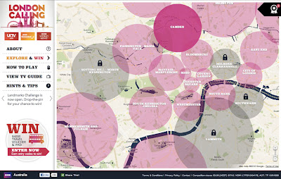
Map of the Week: London Calling
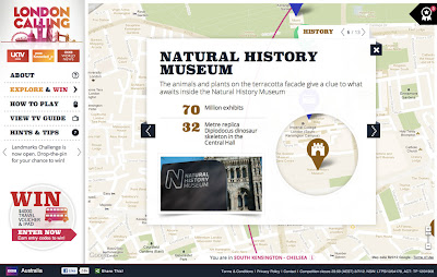
Why we like it: This map is a great way to promote a city and share its history. A brilliantly designed UI, that includes info windows with map cutouts. Additionally, it’s an elegant use of Styled Maps.

In honor of a big year for the city of London, the BBC Australia has created “London Calling” as a way to explore and celebrate London. For those of you who know your way around London, there’s a ‘drop-the-pin’ challenge, where users answer geography questions by placing a pin on the map in the right place. If you get stuck with particular questions, there’s also the option to reach out to the “London Calling” team.

For those that just want to explore London, the map is a great way to learn more about the city that has been getting a lot of attention in light of the Queen’s Jubilee and the upcoming 2012 Olympics. There’s even a chance to win prizes just by exploring the map!

From a design standpoint, this map is really great to look at. Two things about this map really stand out to us. Firstly, Styled Maps has been used to add a sepia effect that reflects the rich history of the city of London. Secondly, this is one of the first use cases where we’ve seen a custom info window that includes a cutout to reveal the highlighted feature below. A clever design choice that’s great to look at!