Symbols and Heatmaps in the Google Maps API

The Google Maps API provides a robust platform in which you can add geographical context to your data in a variety of ways. Data visualization is therefore one of the elements at the heart of the Maps API, and today we’re introducing two new techniques for visualizing your data in flexible and dynamic ways.

Symbols

At SXSW Interactive in 2011, I attended a session on geotemporal data visualization that made me keen to make it easier for Maps API developers to build visualizations similar to those discussed. For this reason I’m particularly excited to introduce a simple, yet powerful, new concept to the Maps API v3 that we call Symbols.

Unlike the image icons currently used for marking locations on a map, a Symbol is defined as a vector shape. The size, stroke width, color, and opacity of the shape, are all set by the Maps API application and can be dynamically modified. A small number of shapes, such as a circle, are provided by the Maps API, and custom shapes can be expressed as an SVG path.

Symbols open up a wide range of compelling new possibilities for data visualization and visual effects. For example, the below map illustrates the expansion of the Walmart chain of stores between 1962 and 2006:

In addition to using symbols to represent point features you can also decorate polylines with Symbols. One or more symbols, such as an arrowhead, can be placed at fixed positions on the polyline or repeated along the polyline. Because the polyline that has been decorated does not need to be visible, this feature can also be used to created dotted or dashed polylines, and just as the style of the symbols can be dynamically modified, so too can their location on the polyline:

Heatmaps

Developers often ask how they can represent large amounts of data on a map. Improvements in web browser technology have increased the number of markers that can be rendered by a Maps API application, but above a certain threshold the density of markers can overwhelm the user.

An alternative approach is to use a heatmap, and to enable this approach we’re launching support for browser rendering of heatmaps by the Maps API using the new Heatmap Layer. Your Maps API application can define the colour spectrum, intensity range, and behaviour of the heatmap when the map is zoomed. Here’s the Walmart example from above, but this time visualized as a heatmap:

If you have any technical questions about these new features, we recommend engaging with our developer community online, or joining our regular Google Maps API Office Hours. If you’re at I/O come see us in person at Office Hours in the Google Maps developer sandbox.
 

MapMyFITNESS and Google Maps API for Business

Being fit means moving and moving means going someplace. We created the MapMyFITNESS applications because we are passionate about living active lifestyles and we wanted a way to both track our progress and explore new activities. We wanted to help people experience this passion for themselves. As our community of MapMyFITNESS users has grown to over 9 million people, we have continually worked to make the applications easier to use and more effective at motivating people to keep moving, whether they’re elite athletes or people just getting started.

A key component to that mission has been our integration with Google Maps, which has made it easy for our users to find new routes or make their own, then share them with the rest of the MapMyFITNESS community. As one of the earliest Google Maps API developers, we noticed it was easy to incorporate the mapping functionality into our product. As we set about to completely rebuild our platform that launched earlier this month, our goal was to expand the ways users could take advantage of Google Maps’ latest API functionality. We’ve gone from tracking and sharing routes in our old platform to providing “Courses” in our new platform. Courses provide our users with real-time data like traffic patterns and temperature, and include “check-in” technology that helps them track workouts, share their progress, and compete in our new leaderboard against specific groups of people. They can compete with local clubs, friends, and most importantly against themselves and their own progress.

The Google Maps API allowed us to show the important information to our users in an easy to read format. Users can visit our site to find new cycling, running or walking routes by searching for the route while viewing it on the map. By using the Google Maps API were we able to incorporate the Street View API to create virtual tours of routes and the Elevation API to calculate how many feet you climb – and descend – during your workout. That familiarity, in addition to fantastic technology and features, makes the user experience both easier and more powerful.

London Calling

Map of the Week: London Calling
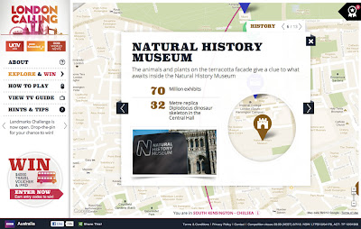
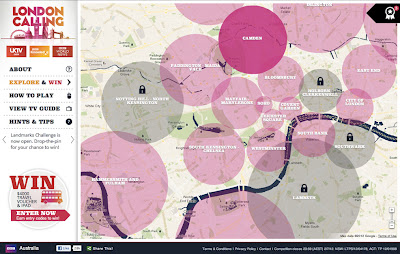
Why we like it: This map is a great way to promote a city and share its history. A brilliantly designed UI, that includes info windows with map cutouts. Additionally, it’s an elegant use of Styled Maps.

In honor of a big year for the city of London, the BBC Australia has created “London Calling” as a way to explore and celebrate London. For those of you who know your way around London, there’s a ‘drop-the-pin’ challenge, where users answer geography questions by placing a pin on the map in the right place. If you get stuck with particular questions, there’s also the option to reach out to the “London Calling” team.

For those that just want to explore London, the map is a great way to learn more about the city that has been getting a lot of attention in light of the Queen’s Jubilee and the upcoming 2012 Olympics. There’s even a chance to win prizes just by exploring the map!

From a design standpoint, this map is really great to look at. Two things about this map really stand out to us. Firstly, Styled Maps has been used to add a sepia effect that reflects the rich history of the city of London. Secondly, this is one of the first use cases where we’ve seen a custom info window that includes a cutout to reveal the highlighted feature below. A clever design choice that’s great to look at!