Introduction of usage limits to the Maps API

When the Maps API Terms of Service were updated in April of this year we announced that usage limits would be introduced to the Maps API starting on October 1st. With October upon us, I’d like to provide an update on how these limits are being introduced, and the impact it will have on your Maps API sites.

The usage limits that now apply to Maps API sites are documented in the Maps API FAQ. However no site exceeding these limits will stop working immediately. We understand that developers need time to evaluate their usage, determine if they are affected, and respond if necessary. There are three options available for sites that are exceeding the limits:

To assist in evaluating whether your site is exceeding the usage limits we will shortly be adding the Maps API to the Google APIs Console. Once available you will be able to track your usage in the APIs Console by providing an APIs Console key when you load the Maps API. If you find that your site does exceed the usage limits each day you can opt to pay for your excess usage by enabling billing on your APIs Console project. We will then start billing excess usage to your credit card when we begin enforcing the usage limits in early 2012.

For very popular sites Maps API Premier is likely to be a more cost effective option. It also offers a number of additional benefits, including terms that permit for-fee and internal use, enterprise technical support, a Service Level Agreement, fixed and invoiced annual pricing, and increased quotas for the Maps API Web Services. For more information on how Maps API Premier could benefit your application please contact the Sales team using this form.

We will announce the availability of the Maps APIs in the APIs Console on this blog later this quarter, and provide more details on how to set up an APIs Console account and update your Maps API application with an APIs Console key. We will also provide at least 30 days notice on this blog before enforcement of the usage limits and billing for excess usage begins.

We understand that the introduction of these limits may be concerning. However with the continued growth in adoption of the Maps API we need to secure its long term future by ensuring that even when used by the highest volume for-profit sites, the service remains viable. By introducing these limits we are ensuring that Google can continue to offer the Maps API for free to the vast majority of developers for many years to come.

 

Google Maps Applications

Mini Maps on Facebook


The most retweeted map on Google Maps Mania this week was definitely this racing game from Mini.

Mini Maps is a great driving game for Facebook that lets you race anywhere in the world on Google Maps. You can race on tracks created by other players, competing against the best track times or even race against others by inviting your Facebook friends to play.

Alternatively you can create your own tracks, set the best time and challenge others to try and beat you.

WorkSnug


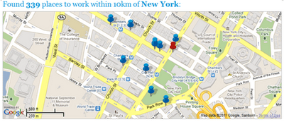
If you are tired of working out of coffee shops then you might want to give WorkSnug a go. WorkSnug uses Google Maps to show you your nearest workspaces with WiFi access.

To find your nearest workspace you just need to enter your location. The results will show you the nearest coffee shops with WiFi but will also show you nearby libraries and other communal spaces where you can work.

If you click on a mapped workspace you can click through to read details about the venue, which includes information about the availability of power, refreshments and the noise levels.

Cooler Planet: Solar Energy Installation Map


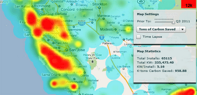
Cooler Planet has created an animated time-line with Google Maps to show the progress of solar installations in California from 1999 through to 2011.

Using data from Go Solar California Statistics the map lets you view time-lines of ‘total installs’, ‘total watts’, ‘watts per install’ and ‘total carbon saved’. It is fascinating using the map to view how solar power installations have blossomed in California over the last decade.

TripsQ


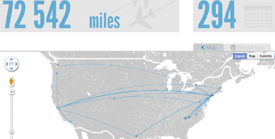
TripsQ is a data visualisation application that aims to help people make full use of the data that they have generated through Foursquare. It uses all the data you have gathered while travelling, by turning your check-ins at airports into useful travel statistics.

Everyone who uses Foursquare can easily sign in to tripsQ and visualise their trips and travel itineraries. TripsQ also provides users with detailed statistics on the distance they’ve travelled, the amount of CO² they’ve produced during each trip and other information about their travels.

NSW election map

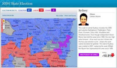
Last weekend NSW voters went to the polls to choose the new State government. As was widely anticipated, coalition parties – Liberals and Nationals have won overwhelming majority of seats. The extent of Labor’s defeat can be best gauged by looking at a map which shows electorates coloured according to a winning party. Blue, traditional colour associated with the Coalition, covers almost the entire State of NSW, with only a few islands of red depicting Labor held electorates. The map was created by Sydney Morning Herald to report on the progress of election results.


The map is quite intuitive to use – just move the mouse over the polygon to reveal electorate name and click on a polygon to bring additional information about the electorate in a side panel. As polygons are created from point data they can be highlighted on mouse over. The downside of this approach is that, because of the limit on how many points browsers can handle, developers had to sacrifice the quality of boundary outlines, keeping points to a minimum. The effects are gaps and overlaps in individual polygons when you zoom too close.

As noted in GIS related media, this was the only map used in reporting election results in NSW. Why this lack of interest to commit resources and present “the battlefield” spatially? I suspect that it may have something to do with the availability of State electoral boundary data – a quick search on the Internet did not yield any results. Creating such boundaries from secondary information sources may have proven too big of a task.