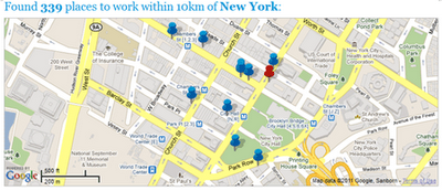
Inspired by the Guardian Data Blog I decided to explore Fusion Tables and Google Maps with Australian data. To start with, I selected a set of Socio-Economic Indexes for Areas, created from 2006 Census data, and postal area boundaries from the Australian Bureau of Statistics (ABS).Today I would like to share a few observations regarding creating maps with data from Fusion Tables.
Although Fusion Tables is not yet a fully featured thematic mapping, analysis and publishing application however, with a little bit of effort, anyone can create informative maps which are visually attractive and fast to deploy. The best thing about Fusion Tables is that you don’t need to manage any complex infrastructure yourself and that the application is free (however, with some limitations on data storage volumes, currently capped at 250MB per account).
Spatial Data
Since Fusion Tables support spatial data only in KML format you have to convert your dataset before uploading it to the server, or alternatively, find a publicly available table that has already been uploaded by someone else.
Google provides a tool to translate SHP data into KML format and to import directly into Fusion Tables but it didn’t work for me with complex data. There are some free alternatives available (really easy to use one is QGIS, for example) but loading other than KML data into Fusion Tables will always be a multi step process.
If you decide to upload your own data, please note a couple of annoying limitations of Fusion Tables. Firstly, complex polygon structures are not supported (for example, I could not upload postcode number 0822 in Northern Territory at full resolution, yet it works perfectly with Google Maps). Secondly, some larger polygons and/or with many parts get generalised automatically as you load them to Fusion Tables as, for example, postal area 7255 in Tasmania (compare the results below – the same KML file as imported to Fusion Tables, on the left, and as displayed directly on Google Map – note green outlines on all, even the smallest islands):

Table search functionality in Fusion Tables is rather crude so, it may not be an easy task to locate what you are looking for. Not to mention that the concept of metadata is non-existent in Fusion Tables so, it is hard to know if the data you find is appropriate for your purposes.
Numeric data
Upload of tabular numeric information in csv format is very straightforward but if you disallow “Export” option up front, you will not be able to edit the data in Fusion Tables. My suggestion is to import the data as “Private” (default option) and allow for “Export”, then add new columns with formulas (if required), and disallow export only when you are ready to publish the data (if at all).
Table Operations
You can easily create a map based on data from numeric tables if those tables contain a “spatial reference” column, for example, postcode numbers (provided you can find equivalent spatial data set in Fusion Tables). To combine numeric and spatial data tables you have to use “Merge” function. My suggestion is to use “smaller table” as a starting point. For example, to create thematic map with postcodes for Sydney area only, select relevant numeric table first and then merge with a table containing postal areas for the entire NSW. Only relevant boundaries will be included in the merged table (ie. the subset of NSW postcodes). If you do the operation in the reverse order, the merged table will contain all postcodes for NSW but only a handful will have the data that can be used in creating a thematic map.
When you “Create View” (ie. copy the table – your own or from other users to your account) or “Merge” tables with spatial geometry column you will lose map formatting parameters (eg. colour setting for polygon fills, etc.). This is very unfortunate, especially when you need to retain colour schema from the original table.
Styling Map
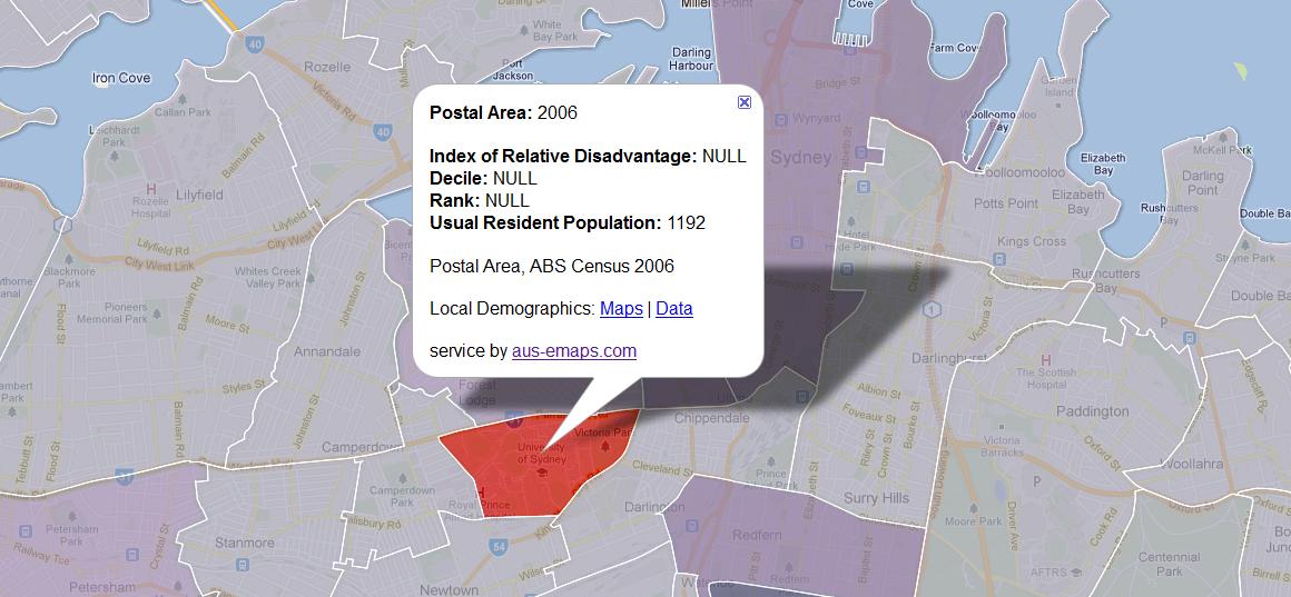
Handling “No data” fields is not easy in Fusion Tables. The problem is that polygons with “no value” in the table default to red fill when rendered on the map (as in the example below – there was no data for 2006 postcode in the merged numeric table). A workaround is to include some value in the table for the missing record (eg. traditional -9999) if you can. Then you can specify map settings to colour only that value, for example, as white and/or fully transparent.
Fully transparent overlays (eg. if fill is set to 0% transparency) are not clickable – it is a very handy feature for handling polygons with missing data in the numeric table (ie. no information window will be displayed when the polygon is clicked). However, when your objective is to present on the map only outlines of the polygons but you still want to display information about those polygons on click of the map, you have to change transparency parameter to a value greater than 0.
Tutorials
If you are eager to start playing with Fusion Tables, Google produced easy to follow tutorial on how to create thematic maps (note, if you are working with your own data, choose “Map” option and not “Intensity Map” in the relevant step).