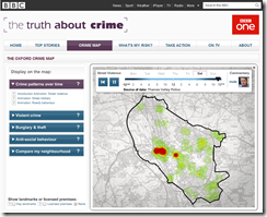
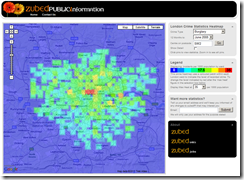
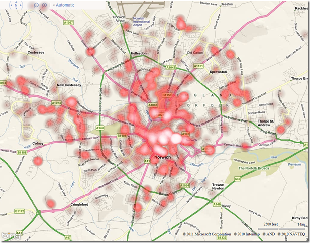
Crime data is frequently presented using “heat maps”. See, for example:
One of the reasons why heat maps are used to visualise crime data is that crimes are typically recorded as individual incidents, occurring at one particular location, yet we tend to want to think of areas at high- or low- risk of crime. We therefore need some way of aggregating those individual crime occurrences into regions that can be analysed.
It doesn’t necessarily make sense to create a thematic map of crimes based on geographic or administrative divisions – a burglar probably does not have much regard for whether he commits a crime in one polling district/ward/street of a city or another, for example, and we should not attempt to fit the distribution of crimes to such arbitrary regions. A heatmap creates a way of summarising and presenting a set of point data with the only influencing factor being the underlying geographic distribution of the points – a greater number of points in the same proximity leads to a “hotter” region.
Seeing as the government has just launched the http://www.police.uk/data portal providing access to a dataset of all reported crime in England and Wales (at a ridiculous cost of £300,000 for 40 basic CSV files, updated monthly), I thought that this would be a good opportunity to update my old heatmapping code to use Bing Maps AJAX v7. What’s more, seeing as Internet Explorer 9 now supports the element, I thought I’d try creating heat maps dynamically in the client-side browser rather than rendering them as images on the server-side, as I typically have done in the past.
To start with, I created an array of locations from which my heatmap would be created. I used all of the “anti-social behaviour” crimes reported by Norfolk constabulary during December 2010 (3,185 records). Having converted each record in the CSV file to a Microsoft.Maps.Location, my array looked like this:
[php]var locations = [
new Microsoft.Maps.Location(52.672802972383, 0.943923796417529),
new Microsoft.Maps.Location(52.624236498992, 1.29493956651563),
new Microsoft.Maps.Location(52.6218783667792, 1.29080178760268),
…
][/php]
I then created a element in my HTML page and placed it so that it exactly covered the
element in which my Bing map would be created:
[php]var canvas = document.createElement(‘canvas’);
canvas.id = ‘heatmapcanvas’
canvas.style.position = ‘absolute’;
canvas.height = 800;
canvas.width = 1024;
canvas.style.zIndex = 1;
document.getElementById(‘mapDiv’).lastChild.appendChild(canvas);[/php]
Note that, as Bing Maps v7 doesn’t have an AddCustomLayer() method as in the previous v6.x versions, I’m having to manually add the canvas element into the correct place in the DOM using appendChild(). This method is not perfect as it places the canvas on top of the map controls as well as the map tiles – I’m going to be looking at this issue later.
The next step is to loop through each of these locations and add a radial gradient at the appropriate pixel location on the canvas (which, because the canvas is placed exactly over the map, can be determined by the tryLocationToPixel() method). The appearance of each heat point produced is affected by two parameters – radius determines the extent to which heat spreads out around a point, and intensity determines how hot it is at the centre of each point.
[php]// Create the Intensity Map
for (var i = 0; i < locations.length; i++) {
var loc = locations[i];
// Convert lat/long to pixel location
var pixloc = map.tryLocationToPixel(loc, Microsoft.Maps.PixelReference.control);
var x = pixloc.x;
var y = pixloc.y;
// Create radial gradient centred on this point
var grd = ctx.createRadialGradient(x, y, 0, x, y, radius);
grd.addColorStop(0.0, ‘rgba(0, 0, 0, ‘ + intensity + ‘)’);
grd.addColorStop(1.0, ‘transparent’);
// Draw the heatpoint onto the canvas
ctx.fillStyle = grd;
ctx.fillRect(x – radius, y – radius, x + radius, y + radius);
}[/php]
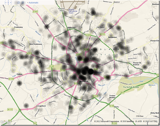
To start with, I used values of radius 20 and intensity 0.25. This meant that the centre of any single point would be plotted as black colour with 0.25 transparency. The visibility of each point would gradually diminish to be fully transparent 20 (pixels) away from the centre. However, the heat of any points closer than 20 (pixels) to each other would create an additive effect, and produce a heat intensity map like this:

Having created a single-channel heat intensity map as above, you can then colourise it by creating a linear gradient, and mapping the alpha values of each pixel on the canvas to the appropriate value from the gradient.
The following code demonstrates a linear colour gradient that progresses from cool colours to hot colours, as typically used in a heat map:
[php]function createColourGradient() {
var ctx = document.createElement(‘canvas’).getContext(‘2d’);
var grd = ctx.createLinearGradient(0, 0, 256, 0);
grd.addColorStop(0.0, ‘magenta’);
grd.addColorStop(0.25, ‘blue’);
grd.addColorStop(0.5, ‘green’);
grd.addColorStop(0.75, ‘yellow’);
grd.addColorStop(1, ‘red’);
ctx.fillStyle = grd;
ctx.fillRect(0, 0, 256, 1);
return ctx.getImageData(0, 0, 256, 1).data;
}[/php]
And this colour gradient can be used to colour the intensity map as follows:
[php] var dat = ctx.getImageData(0, 0, canvas.width, canvas.height);
var pix = dat.data;
var ColourGradient = createColourGradient();
for (var p = 0; p < pix.length;) {
var a = pix[p + 3]*4; // get the alpha value of this pixel
pix[p] = ColourGradient[a]; // get the red value from linear gradient that corresponds to this alpha
pix[p + 1] = ColourGradient[a + 1]; //get the green value based on alpha
pix[p + 2] = ColourGradient[a + 2]; //get the blue value based on alpha
p+=4; // Move on to the next pixel
}
ctx.putImageData(dat, 0, 0);
// Populate the canvas
ctx.fillRect(0, 0, 1024, 800);[/php]
The preceding code might need a bit of explanation…
- Each pixel in the array returned by getImageData() is represented by 4 bytes of data, those bytes representing the Red, Green, Blue, and Alpha values of that pixel.
- So, in the for loop above, the line pix[p+3]*4 is used to return the alpha value only of each pixel in the pix array. (Remember that the canvas was created by placing radialgradients around each point, which varied from an alpha of intensity at the centre to alpha of 0 at a distance of radius from the centre).
- I then look up the pixel that lies at the equivalent position in the ColourGradient spectrum, and copy the first 3 bytes from it into the pixel array, replacing the purely black image with the Red, Green, and Blue values.
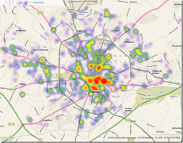
The result of colourising the map using the linear gradient defined above is as follows:

Of course, HTML5 makes it very easy to colour the heat map using any colour gradient you want. Changing the ColorStops in the linear gradient as follows, for example:
[php]grd.addColorStop(0.0, ‘black’);
grd.addColorStop(0.5, ‘red’);
grd.addColorStop(0.9, ‘pink’);
grd.addColorStop(1, ‘white’);[/php]
leads to the following:

There’s still a few issues I’m having with my code – namely trying to get the element inserted at the right place in the DOM to be above the map tiles but underneath the navbar (it seems that all elements in the AJAX v7.0 control are displayed at z-index:0, so I can’t use this as a method top position it). Also, whilst the code above works great in IE9 and Google Chrome, Firefox often gives me the “slow script” warning… I’m not sure what element it’s unhappy with, or whether it’s just that Firefox is not as HTML5-compliant as it claims to be… (ahh the joys of creating cross-browser web apps!)
If I get these issues ironed out, and if anybody shows any interest, then I might package up the complete heatmap code into a reusable class and pop it up on codeplex.
