A few months ago, we launched our new map style which provides a unique backdrop for information delivery and helps content “pop” on the map, allowing people to find what they are looking for more quickly.
The initial feedback was positive but we were given great constructive feedback – users appreciated the new style’s uniqueness and loved the clean, calm look; but, some felt it made aspects of our maps more difficult to read. Specifically, users were interested in:
1. City density – how many cities appear at each zoom level?
2. Street differentiation – can viewers tell which city streets are major and minor?
3. Color contrast – are different map components easily distinguishable?
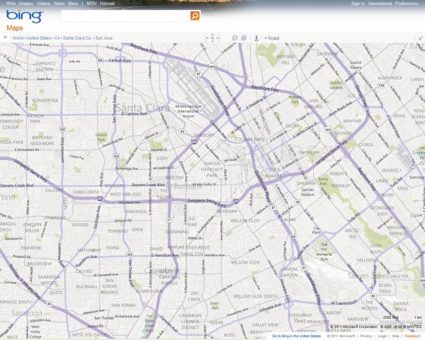
We’ve updated our map style to reflect user feedback so it’s even easier for people to find where to go, how to get there, and what to expect along the way. Key changes are:
A. Increased city density while preserving a clean, visually appealing map
B. Clearer differentiation between major and minor city streets
C. Greater color contrast at the city-level so streets “pop” out more
D. Altered font sizes and contrast for crisper, less cluttered map labels
E. Improved highway shields for US and added new shields for 7 countries
Pictures are worth thousands of words though, so let’s jump into screenshots (or just head straight to Bing Maps to explore). It is difficult to distinguish the differences in these lower-resolution screenshots, so please click on the screenshots or text links to view the full-size pictures
————————————————————————————————————————————————–
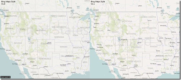
Screenshots #1 & #2 – Zoom Level 5, United States Western/Mountain and Central/Eastern Zones
Key Differences:
- · Increased city density to avoid large expanses of empty space and bring up cities people are likely interested in (See: Montana/Idaho/Utah/Wyoming/Dakotas in Screenshot #2 and Southeastern states in Screenshot #3)
- · Added thousands of city labels in less populated areas while reducing overcrowding in the most densely populated ones. Also ensured that cities and state/province names do not overlap where possible to improve readability.
_______________________________________________
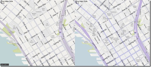
Screenshots #3 – Zoom Level 16 Seattle
Key Differences
- · This screenshot demonstrates a lot of the color contrast and brightness changes made at lower detail levels to differentiate among streets.
- · Freeways (such as I5) had their color intensified by 200% and brightness increased by 5%. Major roads (such as 4th Ave) had their color intensified by 400% and brightness increased by 5 points. Minor roads (such as 1st Ave) had their color intensified by 200% and brightness increased by 5 points as well.
_______________________________________________
Screenshot #4– Zoom Level 4, United States
Key Differences:
- · Sharpened the font for state/province names and country names to improve readability
- · Reduced the information detail at this zoom for smaller countries to reduce clutter (See: Mexico and island countries in the Gulf)
_______________________________________________
Screenshots #5 – Zoom Level 6, Pacific Northwest United States
Key Differences:


