SketchUp Pro Case Study: Dan Tyree

Dan Tyree is an extremely prolific home designer who uses Sketchup Pro with LayOut for his presentations and documentation. He’s designed homes throughout the world. Dan writes:

I started using CAD products when they were still running on a DOS platform; I spent many years using expensive programs, but still struggled to find a good way to present in 3D for my clients. I started using Sketchup Pro as a solution for presentations, and used the DWG exporters to continue the drawings in CAD. I quickly realized that LayOut would allow me to completely eliminate my CAD program—I could create construction documents directly from the presentation model.

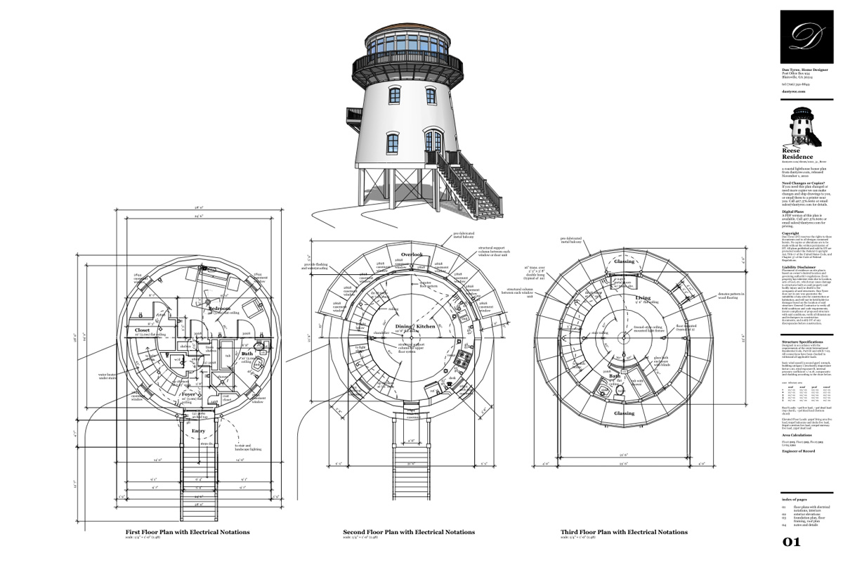
The Reese Residence designed in SketchUp and presented in LayOut

We use Sketchup and LayOut to create amazing presentations for our clients. We are able to show the design in rendered views or immersive videos. Clients are able to picture what the final product will be in vivid detail. We provide the SketchUp file to clients so they can experiment with colors, or just browse through their new home design. We post images and videos of the design on the client’s page (on our website) for their review.


LayOut provides everything we need to create construction documents.

Next, we take the SketchUp model and link it to a LayOut document in order to start developing the construction drawings. These drawings include full-color renderings and perspective views, as well as traditional black and white parallel projections. The interaction between the two products allows us to offer changes throughout the process, even right up to the moment of final printing.

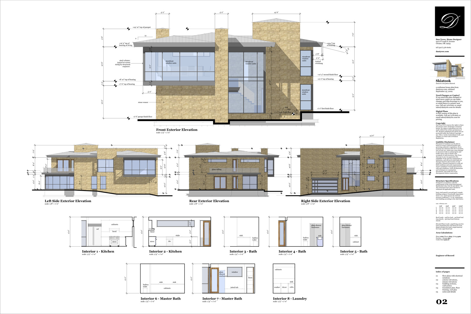
“Skiatook”, presented in LayOut

PDF and CAD files are exported from LayOut. These are made available for our clients to download from our website. SketchUp and LayOut have made presenting a design and creating construction drawings a streamlined process, and have allowed us to provide an affordable custom design product.

Sohei Nishino’s Diorama Maps

Sohei Nishino: Diorama London

The Guardian on the diorama maps of photographer Sohei Nishino, now on display at the Michael Hoppen Gallery in London (until April 2).

Last year, Nishino spent a month walking the streets of London — which, come to think of it, does not seem that long a time for the task in hand. He took over 10,000 photographs, which, on his return to Tokyo, he edited down to 4,000. Then the real work began. Having hand-printed the photographs in his own darkroom, Nishino then set about cutting them up and piecing them together — slowly and meticulously — into a giant composite photographic map of the city of London. It measures 7.5ft

Google Maps: WA housing affordability index

Bankwest has just released a report on housing affordability in WA. Bankwest’s affordability index is a ratio of average house price in a Local Government Area to average worker’s salary. Index values are ranging from 0.9 for Mount Magnet to 49.9 for Peppermint Grove (5 is the upper limit of what is considered “affordable”). The information has been presented in WA Today as an alphabetical list of LGAs with corresponding index value. The paper concluded that workers (defined as a group consisting of police officers, nurses, emergency workers and teachers) “…need to move to Perth’s extremities – or even out of it” to find affordable housing.

This is a good example where information could be presented in a more visually attractive and more informative way – using maps! I have converted Bankwest index table to a thematic map to illustrate how this information could be presented to highlight regions which are still considered affordable.

The key to creating an informative thematic map is to pick the right method for dividing values to be mapped into meaningful categories that convey a certain message. In this case, the story is about locations which are considered affordable. The bank has already defined affordability cut-off value as 5 so that information should be preserved and conveyed on the map. There are many statistical approaches to decide on the split of data to create meaningful categories but on this occasion a simple “rule of thumb” approach is sufficient.

There could be just 2 categories – affordable and non affordable – to convey the message adequately. However, since two-colour map would be quite boring, we could also try to highlight “tail ends” of the data, that is cheap housing areas (eg. those with index value of 2 and below) and those totally out of reach (with index value of 10 and over). The values picked to define the two additional ranges are totally subjective but it does not detract from the key message – that is, which locations have affordable housing.

The selection of colours to present the information on the map is also important. I opted here for a combination to convey the message that there are two categories (affordable and non affordable) but also to indicate grading of index values from “low” to “high”.

Concluding, my appeal is, whenever you think about releasing information relating to postcodes, suburb or other spatially defined regions, please consider putting it also on an interactive map to create a bigger impact! And use my free reference map to enable easy sharing of the information for even greater impact!