The Living Oceans Society is focused on protecting Canada’s Pacific coast from risks such as oil spills, salmon aquaculture and other industrial activity. As part of that, they’ve recently created an interactive map using the Google Earth Plug-in that focus on the oil risk for the coast.
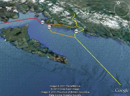
Enbridge, operator of the world’s longest crude oil and liquids pipeline, is planning the “Northern Gateway Pipelines Project”, which would create two pipelines between Alberta’s tar sands and a marine terminal in Kitimat, B.C. Once complete, roughly 220 supertankers would sail the area waters each year.
The Living Oceans map is an attempt to show a massive amount of data expressing the risk to the North Coast if the project goes through.
Visitors can view photos and facts about ecological features like salmon streams and eelgrass beds, critical orca habitat and sea lion haulouts. Other layers show the human presence on the coast, such as areas important for sport fishing and log harvesting and the locations of past marine accidents. Also available are layers showing local opposition to the proposed tankers, including the proposed tanker ban area. Through it all run Enbridge’s proposed tanker routes.
Regardless which side you support in a fight like this, Living Oceans Society has done a great job of using Google Earth to support their side.
 that Google unveiled last night.