Everybody knows that faces in SketchUp can be painted with different materials. What lots of folks don’t know is that you can apply materials to groups and components, too. The following illustration shows the Entity Info dialog box, which is a great place to see which materials are applied to your geometry.

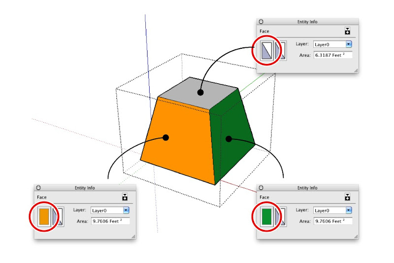
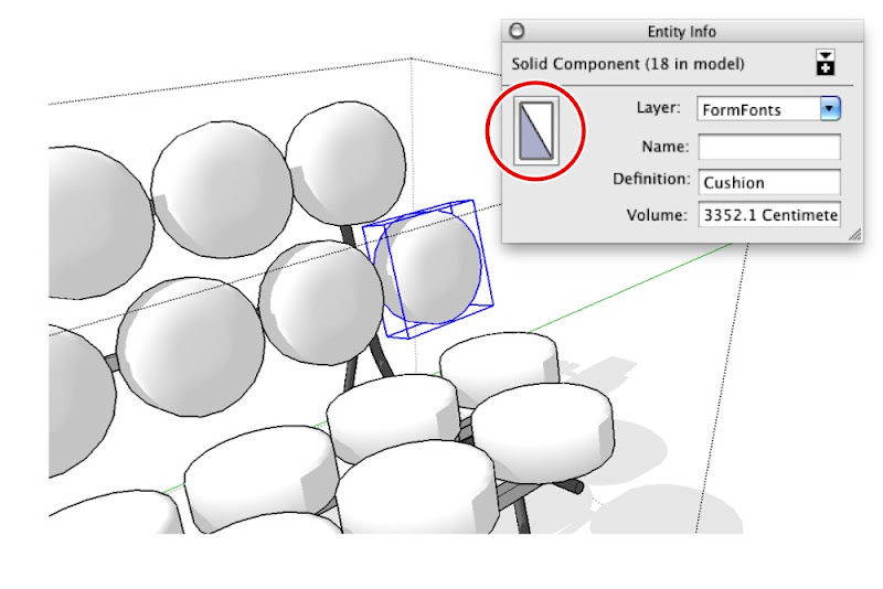
 The Entity Info dialog box (Window > Entity Info) shows thumbnails for the materials assigned to selected entities. When you select a face, it shows thumbnails for the front and back sides of that face (top). Groups and components have material thumbnails, too (bottom).
When you paint a group or component red, only the faces inside it that are painted with the Default* material turn red. Faces that have already been painted with another material don’t change at all.
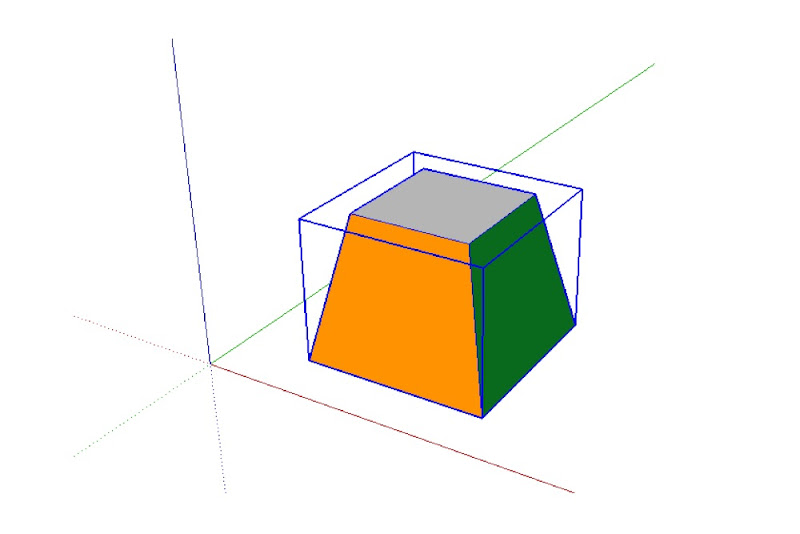
 The above group (top) includes faces that are painted with different materials (bottom). Only the top face is assigned the Default material.

 Applying a material to the entire group only changes the color of faces that are painted the Default material.
This trick also works with groups and components that are nested inside one another. When you apply a material to a top level group or component, all the Default-colored faces that are inside nested, Default-colored groups and components inherit that material automatically. The following diagram is my best attempt at a visual explanation of this phenomenon.
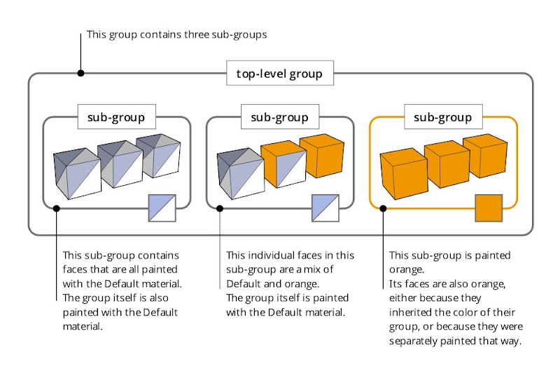
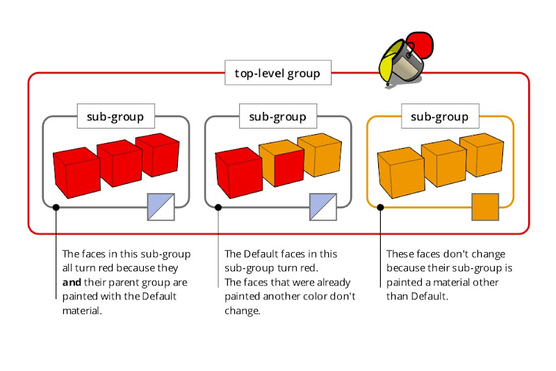 Applying a material to a group or component that in turn contains sub-groups and component instances can be a confusing experience. Just remember that the color you’re painting “trickles down” to Default-colored faces contained within Default-colored groups and components. It’s easier done than said : )
*SketchUp automatically applies the Default material to faces you create from scratch. You can also paint anything with the Default material at any time; just pick it in the Materials Browser (which looks completely different on PCs and Macs.)
 The Windows and Mac versions of the Materials Browser. On the former, the Default material is included as a permanent thumbnail; on the latter, it’s the first material in the “Colors In Model” list.
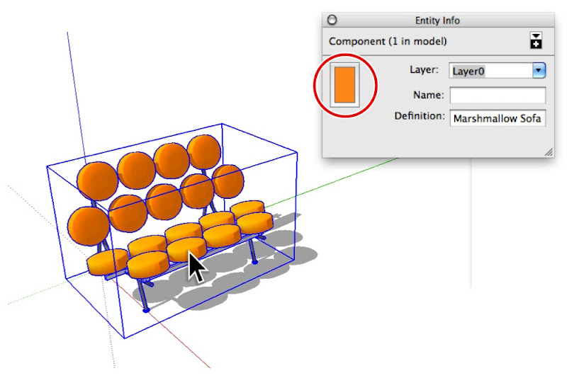
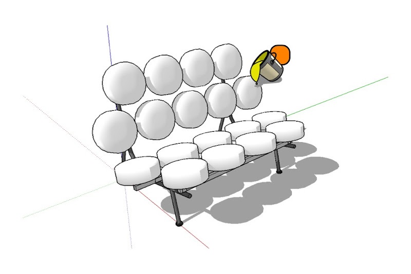
As you can see, this technique is a godsend for building complicated objects that need to change color easily. In the case of the George Nelson Marshmallow Sofa in the images that follow, the cushions are individual component instances nested inside the main Sofa component. These are assigned the Default material.
 I downloaded this George Nelson Marshmallow Sofa component from FormFonts.
 The individual cushions are instances of the same component. Each instance is assigned the Default material.
 The faces that make up the surface of each cushion are also painted with the Default material.
All of the metal and rubber frame pieces are also groups and components, but their faces are all assigned specific materials.
 The faces in the non-cushion parts of the sofa are all assigned materials other than Default.
When you use the Paint Bucket to paint a color—in this case orange—on the main Marshmallow Sofa component, only the cushions take on that color. Everything not assigned the Default material stays exactly the way it is.
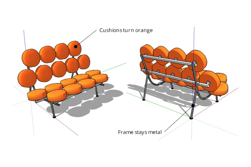 Painting the sofa component orange causes all Default-painted faces to turn that color. Non-Default-colored faces remain unchanged.