Google Maps & Places Tidbits

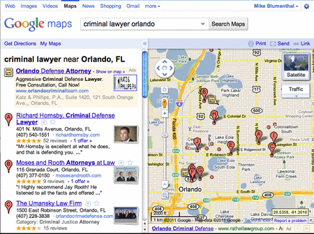
Google Maps Enhances Interface

Yam Regev pointed out that Google Maps has upgraded the UI twith a stacked image and a fluid visual roll over that highlights the listing the pin highlights on the Map:

New Maps Visual Interface

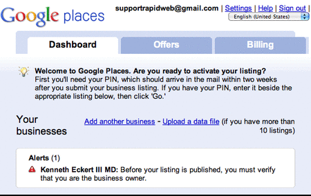
Offers Tab Removed WorldWide

The Offers tab has been removed from Places for every country outside of the US. One can only speculate the reason but I assume that it portends an upgrade to their Offers product line. If you have created a free Places coupon in the UK the only way to currently access or edit the coupon is to change the country flag in the drop down.

Offers tab removed

NASA false color image of the Morganza

The NASA Earth Observatory has just posted a very powerful false-color image of the flooding that resulted from opening the Morganza spillway last week.

morganza.jpg

The reason for the false-color in this imagery is to more easily highlight the flooded areas. Specifically:

The false-color images combine infrared, red, and green wavelengths to help distinguish between water and land. Clear water is blue, and sediment-laden water is a dull blue-gray. Vegetation is red; the brighter the red, the more robust the vegetation. Gray patches away from the center of the floodway are likely farm fields that have recently been burned or cleared.

To see it for yourself, you can download this KML file. Be warned that it’s pulling a 4MB image, so it’ll take a few seconds to load.

(via NASA Earth Observatory Image of the Day)

BBC Nuclear Power Map

BBC Nuclear Power Mapped

BBC Nuclear power mapped


See the development and introduction of Nuclear Power from 1955 onwards with the time slider at the bottom.

BBC Nuclear Power Map.
http://www.bbc.co.uk/news/world-13159407

Notes on the data and map:

Data in the map above is sourced to the IAEA. The map uses current political boundaries.

Data showing the percentage of electricity that nuclear power contributes to each countries’ total electricity production is only available from 1985-2010.