Google Maps Mashups 1

Climate Hot Map


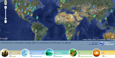
The Union of Concerned Scientists has created this Google Map to show the probable effects of global warming around the world. The map is accompanied by a Climate Hot Map Scavenger Hunt, which if you complete successfully gives you a chance to win a trip for two to the Rio Cachoeira Natural Reserve in Brazil.

The map explores the effect of climate change on people, the environment, the oceans, ecosystems and the temperature. You can select to explore any of these categories on the map using the menu at the bottom of the map.
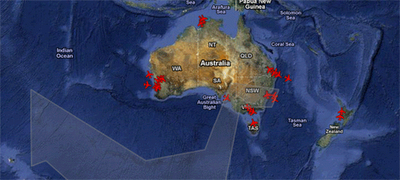
Planefinder.net


The ash cloud created by the eruption of the Puyehue volcano in Chile continues to cause huge disruption to plane flights in Australia. Real-time flight tracking website planefinder.net is using Google Maps to show the location of the ash cloud as it drifts around the southern hemisphere.

The ash cloud is predicted to linger over south-east Australia for some time, causing widespread disruption to flights in and out of Sydney and Melbourne. At the time of writing the planefinder.net map shows a few flights in and out of south-east Australian airports but nowhere near the flight activity that can be seen in and around Perth.
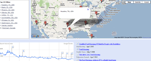
Mibazaar has created a Google Maps based application to explore where people are searching for a given keyword in Google Search.

In this demo of the application you can view where people are searching for different makes of Ford car around the world. For each make of car you can view the ten locations where the most people are searching for that Ford.

The map includes historical data so you can view how searches have changed over the years for each make of car.

Mibazaar – Google Trends – Ford
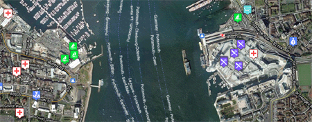
sailorsmap.com


SailorsMap is a Google Map designed to help boat owners find useful places nearby.

Marinas and local stores that may be useful are added to the map on the fly. If your browsing device supports GPS then SailorsMap is automatically positioned at your current location.

As well as displaying nearby points of information, found via Google Maps Search the map, displays the nautical anchorages of Croatia.
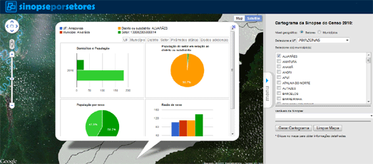
Censo2010


The Instituto Brasileiro de Geografia e Estatística has created an application that allows you to browse the results of the 2010 Brazilian census on a Google Map.

Using the application you can click on a census tract on the map and view demographic information collected in the census. The information includes the population, the percentage of men and women and the percentage of different age groups in the population.

Dotter Example – San Francisco Crime Map
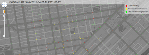

This Google Map displays 5000 crimes in San Francisco almost instantly on a Google Map. The map was created with the Google Maps API and the Dotter.js, a javascript class that generates data URIs.

The crimes displayed were committed in San Francisco between the 25th April and 25th May 2011. What is really impressive about the map is how quickly the 5000 data points load on the map.

If you want to create your own super-fast map with thousands of data points then the Dotter.js class is available on Github

Quake-Catcher Network


Many laptops these days are built with accelerometers that are designed to protect your hard drive from damage. The accelerometer detects sudden movement and can switch the hard drive off so that the heads don’t crash on the platters.

The Quake-Catcher Network realised that they could create the world’s largest and densest earthquake monitoring system simply by using the data from accelerometers in the world’s laptop computers. The Quake-Catcher Network links participating laptops into a single coordinated network that can detect and analyze earthquakes faster and better than ever before.

QCN uses Google Maps to show the data collected from participating laptops and from participating desktop computers with USB sensors. The map also shows the latest USGS reported earthquakes.
Live Call Map – OnSIP


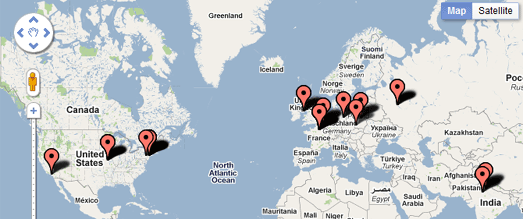
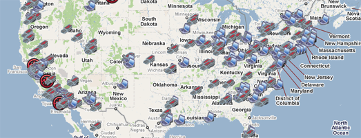
OnSIP, a provider of Voice over IP calls has released a real-time Google Map of calls made using its service.

The map makes nice use of the drop marker animation in the Google Maps v3 API. Each time an OnSIP customer makes or receives a call, a map marker is dropped on the live map, openly displaying call volume peak and trend information. A marker is dropped on the map every time an OnSIP customer makes or receives a call.
Map Channels


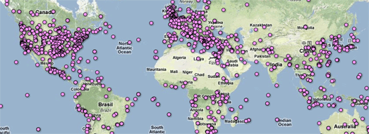
Map Channels, the popular Google Maps creation tool, now lets you add data to a map from Google Fusion Tables.

In the four years that Map Channels has been running over 20,000 maps have been created by its users. It has proved popular with casual map makers and with major news organisations., including Fox News and CBC.

You can create a Google Map with Map Channels using data from a KML, a Google Spreadsheet, a GeoRSS feed, tab delimited text and now with a Google Fusion Table. You can see an example of a Map Channels created map with data provided by a Fusion Table in this Wikipedia Events Map.
Postholer.com


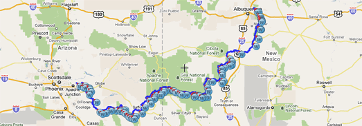
Postholer.com has created a Google Map of some of America’s most interesting trails. The map includes the route of the Appalachian Trail, the Pacific Crest Rail, the Continental Divide Trail and many more.

When you select a trail its route is displayed on the map. You can then select to view waypoints, points of interest, parking, camping spots and photos along the trail from a drop-down menu.

As well as providing a Google Map of the trails Postholer.com also provides a full set of printable maps for each trail.
Ofcom – Broadband Speeds Map

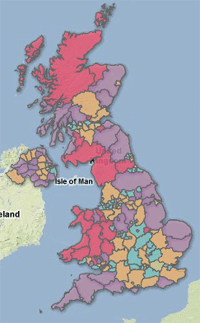
Ofcom, the regulator of the UK communications industries, has created a Google Map to show the speed of broadband throughout the UK.

Each county in the UK has been ranked on how they score on four broadband metrics; average sync speed, percentage getting less than 2Mbit/s, superfast broadband availability and broadband take up. The map displays as a basic heat map with each county coloured to show how they perform overall on each metric.

The map confirms what you already probably suspected. If you want superfast broadband then you are more likely to be lucky if you live in a big city. If you live in the Outer Hebrides then you are probably going to have make do with superslow broadband.


Cross from Google Maps Mania
Adobe Illustrator: Pathfinder Effects and Bad UX

I’ve just started creating the lineart figures for my next book. These need to be submitted to the publisher in print-quality EPS format, which means I’ve had to find and dust off my old copy of Adobe Illustrator and fire it up.

I don’t use Adobe Illustrator very often (clearly, from the accumulated dust and cobwebs on the box), and I’ve never had any formal training on it. However, I understand enough about vector graphics to think that I know the basic ways of working with shapes, and that it shouldn’t be too hard to figure out any well-designed user interface to let me achieve my simple drawing goals…

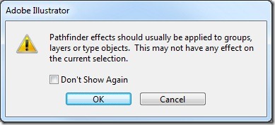
…I’ve just been wrestling for about an hour trying to figure out why a simple task, subtracting one vector shape from another, just kept on giving me the following warning “Pathfinder effects should usually be applied to groups, layers, or type objects”.

pathfinder_error

I’d Googled how to perform the task, and multiple sources all said the same thing.. “simply” select the two objects that you want to merge/trim/crop/union, and then click to select the appropriate Pathfinder action (“subtract”, in this case). No mention of anybody else experiencing this problem.

So, to cut a long story short I had to read the manual. And even though I’ve now found the answer, I’m disappointed… it seems that Adobe Illustrator contains two sets of similar, though effectively unrelated functions, both referred to as “Pathfinder”.

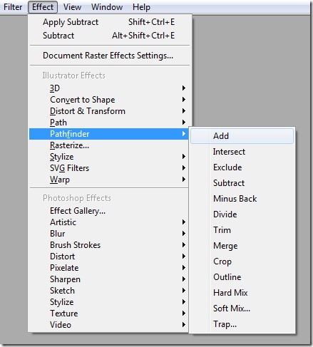
I had been selecting the Pathfinder option from the Effect menu. This gives you options for pathfinder effects such as “Add”, “Intersect”, “Exclude”, “Subtract”, etc. as follows:

pathfinder_groupeffects

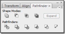
However, the pathfinder menu options only work to add/subtract/intersect layers or groups of shapes. There is an additional pathfinder palette with icons that, when hovered over, show descriptions that sound very similar to the previous menu options: “Add to shape area”, “Intersect shape areas”, “Exclude overlapping shape areas”, “Subtract from shape area”, but these apply to individual shapes.

pathfinder_individualeffects

So, selecting two shapes and clicking “subtract” from the pathfinder menu = error. Clicking on “subtract” from the pathfinder palette = success. Sigh.

Global Warming Map – Review ptI

This is the first half of a two part review.
I did a skim review last month of the Foreign office’s recent Google Earth project showing the effect of 4 degrees average temperature rise. In short, its a great topic to work with but they could have done much better in terms of geoweb usability.

Background
The project was originally produced as a 2D map which has been transferred to a Google Earth plugin and GEarth file presentation with more data. Click on the image to get to the original

I’ll be reviewing the presentation in the GEarth plugin (visible on the main page) and the theGEarth file which is linked to from the main page.

I’ve been in contact with the Kirsty Lewis the project manager (I’m not certain of her exact role) who’s commented on a draft of this review.

Press: Its got a lot of press attention e.g. this piece on channel 4 news.

Review Pros

Icons: The ‘Impacts’ icons (round and multi-colored) are clear, clean and use good symbols so the user can guess what they represent before actually clicking them. I like the use of color as well, by choosing less intense colors they’ve allow differentiation between impact layers without being overpowering.

Topic: Climate change is a global problem so Google Earth represents a good choice of medium. I especially like the overarching approach they’ve taken: ‘what will be the effect of a 4 degree rise in global average temperature’, because certainly here in the UK with our damp, cold winters a 4 degree rise in average temperature seems attractive if you think of it only in a shallow manner.

Acronyms and Jargon: Throughout the project both videos and maps, they steer clear of science acronyms and jargon which is good to see in a science communication project.

Review Cons
Use Points not Areas: The project marks areas with a colored ring and provides an icon of the same color nearby that can be clicked for more information. Thus we click a tap icon to find out that droughts in southern Europe are becoming more common. It would be better to give specific examples of droughts at several points as you could have then involved photos and a human scale story of the global problem. E.g. show a photo of a Farmer in Spain with dry soil running through his fingers and a personal story about how his farm is being affected.
Kirsty commented that she thought that this ‘specific location’ approach would lead to users incorrectly thinking that climate change is completely to blame for specific problems and that explaining the concepts would be complex and unwieldy. I see her point with this, climate change is often one of a number of factors producing a problem such as arid farms and climate change actually affects the probability of drought in a given area, it’s incorrect to say it produces droughts. However, I think you could add caveats that would work around these issues without overloading the content – I explain the issues to 14 year old students in 5 minutes using a betting analogy.

Multiple Areas at the same time: Another problem with the area approach is that its confusing to show multiple overlapping areas at the same time as can be seen in this screen shot of the GEarth plugin version:


There are multiple solutions to this confusing view, e.g. annotate areas with a color fill and white border and allow only one layer at a time to be viewed, I’ve produced a mock up below:

of course, it’s easier still to use points instead of areas as I recommend above.

Kirsty’s answer to this is that the circles make the point that areas are overlapping. That’s a fair point but you need to make it less visually complex when first viewed by a user. The circles would work better if they were introduced added one by one in a GEarth tour with an audio narrative (a concept I explore in in a book chapter).
She also thinks that its important that the GEarth presentation is visually similar to the original map so people understand the links between the projects and that removing the circles would severe that link. I think she’s correct that branding is important but that doesn’t mean you have to re-use all the details – just keeping the icons set is enough to link the GEarth and Map presentations in the user’s mind.
second half next week…