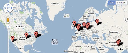
Google Goggles with new look and Russian

Some of you may already be using the new optical character recognition (OCR) and translation of Russian in Google Goggles that we previewed at last week’s Inside Search event. Starting today, we’re pleased to introduce some additional new features, including a map view of your Search History and the ability to copy contact and text results to the clipboard. We’ve also changed the results interface to make it easier to view and navigate through your results.

Russian optical character recognition (OCR) and translation
Since Google Goggles first launched in 2009, it has been able to recognize and translate text in a number of different languages, as long as the language used Latin characters. With the launch of OCR for Russian, Goggles is now able to read Cyrillic characters. Goggles will recognize a picture of Russian text and allow you to translate the text into one of over 40 other languages. Russian OCR is also available for users of Google Goggles on the Google Search app for iOS. Очень полезно!

You can take a picture of Russian text and translate it into over 40 languages.

Map view of your search history
If you’ve enabled search history on Goggles, your history contains a list of all the images that you’ve searched for, as well as some information about where you performed the search if you chose to share your location with Google. Sometimes this can be a pretty long list, so we wanted to give you another way to sort and visualize your Goggles results.

We’ve added a map view, which shows your Goggles image search history on a map so you can quickly zoom and pan to find a query from a particular location.

Easily toggle between map view and list view with the button in the upper right.

Copy contact and text results to clipboard
Finally, imagine that you wanted to grab a URL or telephone number from a sign and email it to yourself. Now, Goggles gives you the option of copying the recognized text to your phone’s clipboard, allowing you to paste the test into a number of applications.

To try these new features download Google Goggles 1.5 from Android Market, or scan the QR code below with your phone.


Bing Maps Geodesics

This month’s MSDN magazine has an article describing how to create curved lines on the Bing Maps AJAX control. While I don’t want to criticise the author at all, there are two comments I would make on the article:

  • Firstly, it’s written using v6.3 of the AJAX control – v7.0 has been available for well over 6 months now and (despite some teething problems) this latest version is recommended for all new development.
  • Secondly, the article describes how to draw arbitrary Bezier curves on the projected plane of the map. Whilst this is an interesting exercise (and the author goes on to describe important concepts such as how to test the routine), it’s not actually that useful. More often, when we see curved lines on a map, we expect them to represent geodesics – the shortest path between two points on the surface of the earth. Although this was never the intention of the article, Bing Maps evangelist Chris Pendleton mistakenly drew this conclusion and tweeted a link to the article stating that it demonstrated geodesics, when in fact it does not.

Therefore, I thought that responding to this article would provide a good prompt for me to dust off and update my own v6.x geodesic curve script from several years ago (originally published here).

What’s a Geodesic, anyway?

A geodesic is a “locally-length minimising curve” (Mathworld) – it’s the shortest path between any two points on a given surface. On a flat plane, like a piece of paper, a geodesic is a straight line. On a sphere, a geodesic is a great circle. When dealing with geospatial data, a geodesic is the shortest distance between two points on the surface of the earth.

Generally speaking, Bing Maps has no regard for geodesic shapes relative to the earth’s surface – instead it draws shapes directly onto the projected map image. Drawing a straight line between two points on a map represents the shortest path between those points in the projected plane of the map, but it generally does not represent the shortest path between those same two points on the surface of the earth.

For example, consider a polyline drawn between Munich and Seattle, both of which lie at a latitude of approximately 48 degrees. You can define a polyline connecting these two points as follows:

Microsoft.Maps.Polyline([
  new Microsoft.Maps.Location(48, 11.5),
  new Microsoft.Maps.Location(48, -122)]);

When displayed on the map, this polyline will follow a constant latitude between the two points, like this:image

However, this is certainly not the shortest route between Munich and Seattle. If you are unsure why, consider how this same line would appear when viewed on a 3-dimensional model of the earth. In the screenshot below, the line that follows a constant latitude of 48 degrees, as shown above, is plotted in red, while the geodesic line that represents the true shortest line connecting the destinations is shown in blue:

image

Notice how, rather than being parallel to the equator, the geodesic route goes much further north over the top of the UK, then over Iceland, Greenland, and much of Canada before turning south again into Seattle. You can try this yourself on a globe – the geodesic route is the path that a piece of string follows when held tight between two locations. (For those readers familiar with SQL Server, the red line above is equivalent to a route calculated using the geometry datatype, while the blue line is equivalent to using the geography datatype)

As shown above, the shortest “straight line” route on a map is not the shortest direct path between two points on a globe. Likewise, the shortest geodesic route between two locations on the globe does not generally correspond to a straight line on a map. This is why, when airline companies show maps illustrating the flightpaths to various destinations, the lines appear curved – because they’re representing the geodesic path on the surface of the earth, which, when projected onto a map, will generally not be straight lines:

image

Drawing Geodesic curves in Bing Maps

Geodesics are clearly very useful if you want to visualise the path of shortest distance between two points. So how do you go about drawing geodesic curves in Bing Maps? Well, Bing Maps does not support curved geometries directly, so instead we must approximate the shape of a geodesic curve by creating a polyline containing several small segments. Using a larger number of segments will make the polyline appear more smooth and more closely resemble the shape of the smooth curve, but will also increase its complexity. I find that using 32 segments is more than sufficient accuracy for most maps. We’ll call this value n.

var n = 32;

Then, we need to determine the overall extent of the route, which we’ll call d. The shortest distance between any two points on a sphere is the great circle distance. Assuming that the coordinates of the start and end points are (lat1, lon1) and (lat2, lon2) respectively, measured in Radians, then we can work out the great circle distance between them using the Haversine formula, as follows:

var d = 2 * asin(sqrt(pow((sin((lat1 - lat2) / 2)), 2) + cos(lat1) * cos(lat2) * pow((sin((lon1 - lon2) / 2)), 2)));

We then determine the coordinates of the endpoints of each segment along the geodesic path. If f is a value from 0 to 1, which represents the percentage of the route travelled from the start point (lat1,lon1) to the end point (lat2,lon2), then the latitude and longitude coordinates of the point that lies at f proportion of the route can be calculated as follows:

var A = sin((1 - f) * d) / sin(d);
var B = sin(f * d) / sin(d);

// Calculate 3D Cartesian coordinates of the point
var x = A * cos(lat1) * cos(lon1) + B * cos(lat2) * cos(lon2);
var y = A * cos(lat1) * sin(lon1) + B * cos(lat2) * sin(lon2);
var z = A * sin(lat1) + B * sin(lat2);

// Convert these to latitude/longitude
var lat = atan2(z, sqrt(pow(x, 2) + pow(y, 2)));
var lon = atan2(y, x);

By repeating the above with different values of f, (the number of repetitions set according to the number of segments in the line), we can construct an array of latitude and longitude coordinates at set intervals along the geodesic curve from which a polyline can be constructed.

The following code listing wraps this all together in a reusable function, ToGeodesic, that returns an array of points that approximate the geodesic path between the supplied polyline or polygon locations.

To demonstrate the use of the function, I’ve added two entity collections to the map. The simple layer acts a regular shape layer, containing polylines and polygons displayed in red. Whenever an entity is added to this collection, the entityAdded event handler fires, which converts the added entity into the equivalent geodesic shape and adds it to the geodesicShapeLayer, displayed in blue. By maintaining two layers you can continue to deal with shapes as per normal in the layer collection – the additional points needed to simulate the geodesic display of each shape only get added in the copy of the shape added to the geodesicShapeLayer. You may then, for example, choose not to display the non-geodesic layer and only use it as a method to manage shapes, while the geodesic layer is used to actually display them on the map.


Here’s the results, showing both the flat (red) and geodesic (blue) layers of a polyline and a polygon:

image

Google Maps Mashups 1

Climate Hot Map


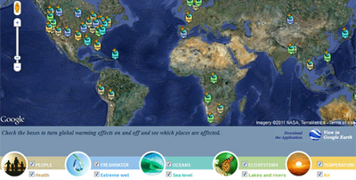
The Union of Concerned Scientists has created this Google Map to show the probable effects of global warming around the world. The map is accompanied by a Climate Hot Map Scavenger Hunt, which if you complete successfully gives you a chance to win a trip for two to the Rio Cachoeira Natural Reserve in Brazil.

The map explores the effect of climate change on people, the environment, the oceans, ecosystems and the temperature. You can select to explore any of these categories on the map using the menu at the bottom of the map.

Planefinder.net


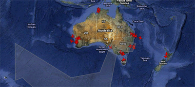
The ash cloud created by the eruption of the Puyehue volcano in Chile continues to cause huge disruption to plane flights in Australia. Real-time flight tracking website planefinder.net is using Google Maps to show the location of the ash cloud as it drifts around the southern hemisphere.

The ash cloud is predicted to linger over south-east Australia for some time, causing widespread disruption to flights in and out of Sydney and Melbourne. At the time of writing the planefinder.net map shows a few flights in and out of south-east Australian airports but nowhere near the flight activity that can be seen in and around Perth.

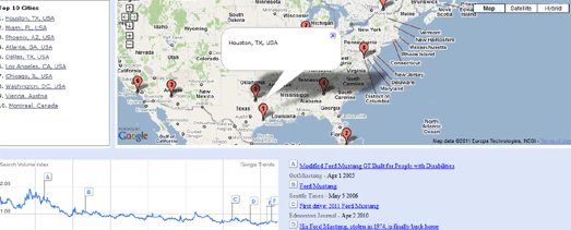
Mibazaar has created a Google Maps based application to explore where people are searching for a given keyword in Google Search.

In this demo of the application you can view where people are searching for different makes of Ford car around the world. For each make of car you can view the ten locations where the most people are searching for that Ford.

The map includes historical data so you can view how searches have changed over the years for each make of car.

Mibazaar – Google Trends – Ford

sailorsmap.com


SailorsMap is a Google Map designed to help boat owners find useful places nearby.

Marinas and local stores that may be useful are added to the map on the fly. If your browsing device supports GPS then SailorsMap is automatically positioned at your current location.

As well as displaying nearby points of information, found via Google Maps Search the map, displays the nautical anchorages of Croatia.

Censo2010


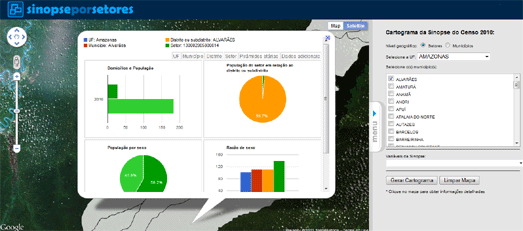
The Instituto Brasileiro de Geografia e Estatística has created an application that allows you to browse the results of the 2010 Brazilian census on a Google Map.

Using the application you can click on a census tract on the map and view demographic information collected in the census. The information includes the population, the percentage of men and women and the percentage of different age groups in the population.

Dotter Example – San Francisco Crime Map


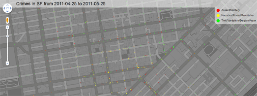
This Google Map displays 5000 crimes in San Francisco almost instantly on a Google Map. The map was created with the Google Maps API and the Dotter.js, a javascript class that generates data URIs.

The crimes displayed were committed in San Francisco between the 25th April and 25th May 2011. What is really impressive about the map is how quickly the 5000 data points load on the map.

If you want to create your own super-fast map with thousands of data points then the Dotter.js class is available on Github

Quake-Catcher Network


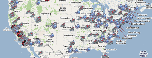
Many laptops these days are built with accelerometers that are designed to protect your hard drive from damage. The accelerometer detects sudden movement and can switch the hard drive off so that the heads don’t crash on the platters.

The Quake-Catcher Network realised that they could create the world’s largest and densest earthquake monitoring system simply by using the data from accelerometers in the world’s laptop computers. The Quake-Catcher Network links participating laptops into a single coordinated network that can detect and analyze earthquakes faster and better than ever before.

QCN uses Google Maps to show the data collected from participating laptops and from participating desktop computers with USB sensors. The map also shows the latest USGS reported earthquakes.

Live Call Map – OnSIP


OnSIP, a provider of Voice over IP calls has released a real-time Google Map of calls made using its service.

The map makes nice use of the drop marker animation in the Google Maps v3 API. Each time an OnSIP customer makes or receives a call, a map marker is dropped on the live map, openly displaying call volume peak and trend information. A marker is dropped on the map every time an OnSIP customer makes or receives a call.

Map Channels


Map Channels, the popular Google Maps creation tool, now lets you add data to a map from Google Fusion Tables.

In the four years that Map Channels has been running over 20,000 maps have been created by its users. It has proved popular with casual map makers and with major news organisations., including Fox News and CBC.

You can create a Google Map with Map Channels using data from a KML, a Google Spreadsheet, a GeoRSS feed, tab delimited text and now with a Google Fusion Table. You can see an example of a Map Channels created map with data provided by a Fusion Table in this Wikipedia Events Map.

Postholer.com


Postholer.com has created a Google Map of some of America’s most interesting trails. The map includes the route of the Appalachian Trail, the Pacific Crest Rail, the Continental Divide Trail and many more.

When you select a trail its route is displayed on the map. You can then select to view waypoints, points of interest, parking, camping spots and photos along the trail from a drop-down menu.

As well as providing a Google Map of the trails Postholer.com also provides a full set of printable maps for each trail.

Ofcom – Broadband Speeds Map

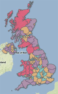
Ofcom, the regulator of the UK communications industries, has created a Google Map to show the speed of broadband throughout the UK.

Each county in the UK has been ranked on how they score on four broadband metrics; average sync speed, percentage getting less than 2Mbit/s, superfast broadband availability and broadband take up. The map displays as a basic heat map with each county coloured to show how they perform overall on each metric.

The map confirms what you already probably suspected. If you want superfast broadband then you are more likely to be lucky if you live in a big city. If you live in the Outer Hebrides then you are probably going to have make do with superslow broadband.


Cross from Google Maps Mania